Conceptual Maps in R

Author

Martin Schweinberger

Introduction

This tutorial introduces conceptual maps — a family of visualisation techniques that represent semantic relationships between words or concepts as a spatial network, where proximity encodes similarity. Conceptual maps have become an increasingly popular tool in corpus linguistics, cognitive linguistics, and digital humanities for exploring how words cluster into meaning domains, how concepts relate across registers or time periods, and how semantic structure can be revealed from large bodies of text (Schneider 2024).

The key idea is simple: words that tend to appear in similar contexts — or that share distributional properties — are semantically related. By converting this distributional information into a similarity matrix and then applying a spring-layout algorithm (or a related graph-drawing method), we can produce two-dimensional maps where semantically close words cluster together and semantically distant words are pushed apart. The maps are not just aesthetically appealing; they are analytically informative, revealing lexical fields, semantic neighbourhoods, and conceptual organisation that would be invisible in a table of numbers.

Gerold Schneider and colleagues have been prominent advocates of conceptual maps as a practical and accessible visualisation tool for linguists (Schneider 2024), making the case that spring-layout graphs offer a more interpretively transparent alternative to purely statistical dimensionality-reduction techniques such as PCA or MDS.

Prerequisite Tutorials

This tutorial assumes familiarity with:

Familiarity with Network Analysis is helpful but not required.

Learning Objectives

By the end of this tutorial you will be able to:

  1. Explain what a conceptual map is, how it differs from a word cloud or a dendrogram, and when it is appropriate
  2. Build three types of similarity matrices from text: word co-occurrence, document-term (TF-IDF), and word embedding cosine similarity
  3. Convert a similarity matrix into a weighted graph and apply a spring-layout algorithm
  4. Produce publication-quality conceptual maps with igraph, ggraph, and qgraph
  5. Interpret the spatial structure of a conceptual map: clusters, bridges, and peripheral nodes
  6. Compare spring-layout maps with classical MDS as an alternative spatial representation
Citation

Schweinberger, Martin. 2026. Conceptual Maps in R. Brisbane: The Language Technology and Data Analysis Laboratory (LADAL). url: https://ladal.edu.au/tutorials/conceptmaps/conceptmaps.html (Version 2026.02.24).


What Is a Conceptual Map?

Section Overview

What you will learn: The conceptual and technical foundations of conceptual maps; how they differ from related visualisations; and the algorithmic principles behind spring-layout graphs

The Core Idea: Distributional Similarity

The distributional hypothesis — one of the foundational principles of computational linguistics — states that words occurring in similar contexts tend to have similar meanings (Firth 1957; Harris 1954). If we count how often words co-occur with each other (or how often they appear in similar document contexts), we can construct a similarity matrix that numerically encodes semantic relatedness.

A conceptual map turns this matrix into a visual space. Words (or concepts, documents, or any linguistic units) become nodes in a graph, and their pairwise similarities become edge weights. A spring-layout algorithm then positions the nodes so that:

  • Strongly similar pairs are pulled together (short edges, tight clusters)
  • Weakly similar or dissimilar pairs are pushed apart (long edges or absent edges)

The result is a two-dimensional spatial arrangement where the geometry of the map encodes semantic structure — clusters correspond to lexical fields, bridges correspond to polysemous or connecting words, and peripheral nodes correspond to domain-specific or infrequent terms.

How Spring Layouts Work

The Fruchterman–Reingold algorithm (Fruchterman and Reingold 1991) — the most widely used spring-layout method — models the graph as a physical system:

  • Each edge acts like a spring: it pulls connected nodes towards each other with a force proportional to their weight
  • Each pair of nodes exerts a repulsive force: unconnected or weakly connected nodes push each other away
  • The algorithm iterates until the system reaches a minimum-energy equilibrium

This physical analogy gives the algorithm its name. The final layout minimises a global energy function, placing highly connected nodes near each other and sparsely connected nodes far apart.

Spring Layout vs. Other Spatial Methods
Comparison of spatial visualisation methods for semantic data
Method What it preserves Strengths Limitations
Spring layout (Fruchterman-Reingold) Graph topology and edge weights Intuitive clusters; interactive via igraph/ggraph Layout is stochastic (set a seed!); does not preserve exact distances
Classical MDS Pairwise distances as faithfully as possible Mathematically principled; deterministic Less visually clear for dense graphs
t-SNE / UMAP Local neighbourhood structure Excellent for high-dimensional embeddings Hyperparameter-sensitive; not directly available in base R
PCA (biplot) Maximum variance directions Shows axes of variation Axes not directly interpretable as semantic dimensions

For conceptual maps used in linguistic research, spring layout (with igraph/ggraph) or qgraph are the most common choices. MDS is a useful comparison baseline and is covered in the Dimension Reduction tutorial.

Three Routes to a Conceptual Map

This tutorial covers three methods for constructing the similarity matrix that feeds into the map:

Route 1 — Co-occurrence matrix: Count how often pairs of target words appear within the same window of text (e.g. within 5 words of each other). Convert raw counts to a similarity score (e.g. pointwise mutual information, PMI). Best for exploring the immediate lexical context of a set of target words.

Route 2 — Document-term matrix (TF-IDF): Represent each word as a vector of TF-IDF weights across documents. Compute cosine similarity between word vectors. Best for exploring topical or register-level semantic relationships.

Route 3 — Word embeddings: Use pre-trained dense word vectors (e.g. GloVe) in which each word is represented as a 50–300 dimensional vector. Compute cosine similarity. Best for capturing broad distributional semantics trained on large corpora.

Which statement best describes what a spring-layout algorithm does when drawing a conceptual map?

  1. It places words in alphabetical order along the x-axis and by frequency along the y-axis
  2. It positions words so that frequently occurring words are placed at the centre
  3. It arranges words so that strongly similar pairs are pulled together and dissimilar pairs are pushed apart, simulating a physical spring system
  4. It performs principal component analysis and plots the first two components
Answer

c) It arranges words so that strongly similar pairs are pulled together and dissimilar pairs are pushed apart, simulating a physical spring system

The Fruchterman–Reingold spring-layout algorithm models the graph as a physical system of springs (attractive forces between connected nodes) and repulsive charges (between all node pairs). The layout minimises a global energy function, naturally grouping semantically related words into clusters. Options (a) and (b) describe simpler but semantically uninformative arrangements. Option (d) describes PCA, which is a separate dimensionality-reduction technique that does not use graph topology.


Setup

Installing Packages

Code
# Run once — comment out after installation
install.packages("tidyverse")
install.packages("tidytext")
install.packages("gutenbergr")
install.packages("igraph")
install.packages("ggraph")
install.packages("qgraph")
install.packages("widyr")
install.packages("Matrix")
install.packages("smacof")
install.packages("text2vec")
install.packages("flextable")
install.packages("ggrepel")
install.packages("RColorBrewer")
install.packages("viridis")

Loading Packages

Code
options(stringsAsFactors = FALSE)
options("scipen" = 100, "digits" = 12)

library(tidyverse)
library(tidytext)
library(gutenbergr)
library(igraph)
library(ggraph)
library(qgraph)
library(widyr)
library(Matrix)
library(smacof)
library(text2vec)
library(flextable)
library(ggrepel)
library(RColorBrewer)
library(viridis)

Building the Data

Section Overview

What you will learn: How to download and prepare a real corpus, construct a toy dataset for experimentation, and understand what data structure feeds into a conceptual map

The Main Example: Sense and Sensibility

Throughout this tutorial we use Jane Austen’s Sense and Sensibility (1811), downloaded from Project Gutenberg. This novel provides a rich vocabulary of emotion, social relations, and domestic life — an ideal domain for exploring semantic clustering.

Code
# Download Sense and Sensibility from Project Gutenberg
# gutenberg_id 161
sns <- gutenberg_download(161, mirror = "http://mirrors.xmission.com/gutenberg/")

# Tokenise to words, remove stop words and punctuation
data("stop_words")  # built-in tidytext stop word list

sns_words <- sns |>
  # add a paragraph/chunk ID (every 10 lines = one context window)
  dplyr::mutate(chunk = ceiling(row_number() / 10)) |>
  tidytext::unnest_tokens(word, text) |>
  dplyr::anti_join(stop_words, by = "word") |>
  dplyr::filter(str_detect(word, "^[a-z]+$"),   # letters only
                str_length(word) > 2)             # at least 3 characters
Total tokens (after cleaning): 35573 
Unique word types: 5760 
Number of 10-line chunks: 1268 

We focus on a curated set of emotion and social relation words that are frequent enough to produce stable co-occurrence counts. This makes the resulting map interpretable and pedagogically clear.

Code
# Target vocabulary: emotion, character, social, and moral terms
target_words <- c(
  # emotions
  "love", "hope", "fear", "joy", "pain", "grief", "happiness",
  "sorrow", "pleasure", "affection", "passion", "anxiety", "distress",
  "comfort", "delight", "misery", "pride", "shame", "anger",
  # social relations
  "friendship", "marriage", "family", "sister", "mother", "heart",
  "feeling", "sensibility", "sense", "honour", "duty",
  # character
  "beauty", "elegance", "worth", "character", "spirit", "temper"
)

cat("Target vocabulary size:", length(target_words), "\n")
Target vocabulary size: 36 

Toy Dataset for Experimentation

For readers who want a smaller, fully self-contained example to experiment with, here is a toy co-occurrence matrix for 12 words across three semantic domains. You can use this to test code without downloading the Gutenberg corpus.

Code
# Toy similarity matrix: 12 words, three domains
# (body parts, emotions, social roles)
toy_words <- c("heart", "hand", "eye", "mind",
               "joy", "fear", "love", "grief",
               "friend", "mother", "sister", "husband")

set.seed(42)
# Build a structured similarity matrix with within-domain similarity > between-domain
n <- length(toy_words)
toy_sim <- matrix(0.1, nrow = n, ncol = n,
                  dimnames = list(toy_words, toy_words))
diag(toy_sim) <- 1

# Within-domain similarities (higher)
body   <- 1:4; emotion <- 5:8; social <- 9:12
for (grp in list(body, emotion, social)) {
  for (i in grp) for (j in grp) {
    if (i != j) toy_sim[i, j] <- runif(1, 0.45, 0.75)
  }
}
# Cross-domain: heart <-> emotion (polysemy)
toy_sim["heart", emotion] <- toy_sim[emotion, "heart"] <- runif(4, 0.3, 0.5)

# Ensure symmetry
toy_sim <- (toy_sim + t(toy_sim)) / 2
diag(toy_sim) <- 1

cat("Toy similarity matrix (first 6 rows/cols):\n")
Toy similarity matrix (first 6 rows/cols):
Code
round(toy_sim[1:6, 1:6], 2)
      heart hand  eye mind  joy fear
heart  1.00 0.71 0.70 0.60 0.30 0.34
hand   0.71 1.00 0.57 0.60 0.10 0.10
eye    0.70 0.57 1.00 0.66 0.10 0.10
mind   0.60 0.60 0.66 1.00 0.10 0.10
joy    0.30 0.10 0.10 0.10 1.00 0.73
fear   0.34 0.10 0.10 0.10 0.73 1.00

Route 1: Co-occurrence Conceptual Maps

Section Overview

What you will learn: How to count word co-occurrences within context windows, convert counts to PMI similarity scores, threshold the matrix to build a sparse graph, and visualise the result with igraph and ggraph

What Is a Co-occurrence Matrix?

A co-occurrence matrix records how many times each pair of target words appears within the same context window — here, within the same 10-line chunk of text. Words that frequently share contexts are semantically related: they tend to appear in the same scenes, describe the same characters, or participate in the same semantic frame.

Raw counts are converted to Pointwise Mutual Information (PMI):

\[\text{PMI}(w_1, w_2) = \log \frac{P(w_1, w_2)}{P(w_1) \cdot P(w_2)}\]

PMI measures how much more often two words co-occur than would be expected by chance if they were independent. Positive PMI values indicate attraction; negative values (rare in filtered matrices) indicate repulsion. We use positive PMI (PPMI), which floors negative values at zero.

Step 1: Count Co-occurrences

Code
# Keep only target words, then count pairwise chunk co-occurrences
sns_target <- sns_words |>
  dplyr::filter(word %in% target_words)

# Count co-occurrences within chunks using widyr::pairwise_count
cooc_counts <- sns_target |>
  widyr::pairwise_count(word, chunk, sort = TRUE, upper = FALSE)

cat("Total co-occurrence pairs found:", nrow(cooc_counts), "\n")
Total co-occurrence pairs found: 336 
Code
head(cooc_counts, 10)
# A tibble: 10 × 3
   item1  item2         n
   <chr>  <chr>     <dbl>
 1 sister mother       26
 2 heart  mother       22
 3 sister heart        18
 4 mother affection    18
 5 sister hope         16
 6 family mother       15
 7 sister pleasure     14
 8 mother hope         14
 9 sister love         14
10 heart  love         14

Step 2: Compute PPMI

Code
# Total chunk appearances per word (marginal counts)
word_totals <- sns_target |>
  dplyr::count(word, name = "n_word")

total_chunks <- n_distinct(sns_target$chunk)

# Join marginals and compute PMI
cooc_pmi <- cooc_counts |>
  dplyr::rename(w1 = item1, w2 = item2, n_cooc = n) |>
  dplyr::left_join(word_totals, by = c("w1" = "word")) |>
  dplyr::rename(n_w1 = n_word) |>
  dplyr::left_join(word_totals, by = c("w2" = "word")) |>
  dplyr::rename(n_w2 = n_word) |>
  dplyr::mutate(
    p_cooc = n_cooc / total_chunks,
    p_w1   = n_w1  / total_chunks,
    p_w2   = n_w2  / total_chunks,
    pmi    = log2(p_cooc / (p_w1 * p_w2)),
    ppmi   = pmax(pmi, 0)           # floor at 0 (positive PMI only)
  ) |>
  dplyr::filter(ppmi > 0)           # keep only pairs with positive association

cat("Pairs with positive PMI:", nrow(cooc_pmi), "\n")
Pairs with positive PMI: 174 

Step 3: Build and Threshold the Graph

For a readable map, we retain only the strongest edges. Keeping all pairs produces a dense hairball; thresholding to the top edges reveals the underlying cluster structure.

Code
# Keep top edges by PPMI — enough for a readable map
ppmi_threshold <- quantile(cooc_pmi$ppmi, 0.60)  # top 40% of pairs

cooc_edges <- cooc_pmi |>
  dplyr::filter(ppmi >= ppmi_threshold) |>
  dplyr::select(from = w1, to = w2, weight = ppmi)

# Build igraph object
g_cooc <- igraph::graph_from_data_frame(cooc_edges, directed = FALSE)

# Add semantic domain as a node attribute for colouring
# Using case_when avoids fragile rep() counts that break if target_words changes
domain_lookup <- tibble::tibble(word = target_words) |>
  dplyr::mutate(domain = dplyr::case_when(
    word %in% c("love", "hope", "fear", "joy", "pain", "grief", "happiness",
                "sorrow", "pleasure", "affection", "passion", "anxiety",
                "distress", "comfort", "delight", "misery", "pride",
                "shame", "anger")                                   ~ "Emotion",
    word %in% c("friendship", "marriage", "family", "sister", "mother",
                "heart", "feeling", "sensibility", "sense", "honour",
                "duty")                                             ~ "Social",
    TRUE                                                            ~ "Character"
  ))

domain_vec <- domain_lookup$domain[match(V(g_cooc)$name, domain_lookup$word)]
V(g_cooc)$domain <- domain_vec

cat("Nodes in graph:", vcount(g_cooc), "\n")
Nodes in graph: 33 
Code
cat("Edges in graph:", ecount(g_cooc), "\n")
Edges in graph: 70 

Step 4: Draw the Spring-Layout Map with igraph

Code
set.seed(2024)   # spring layout is stochastic — always set a seed for reproducibility

# Compute Fruchterman-Reingold layout
lay <- igraph::layout_with_fr(g_cooc, weights = E(g_cooc)$weight)

# Colour palette by domain
domain_cols <- c("Emotion" = "#E07B54", "Social" = "#5B8DB8", "Character" = "#6BAF7A")
node_cols   <- domain_cols[V(g_cooc)$domain]

# Plot
par(mar = c(1, 1, 2, 1))
plot(
  g_cooc,
  layout        = lay,
  vertex.color  = node_cols,
  vertex.size   = 12,
  vertex.label  = V(g_cooc)$name,
  vertex.label.cex   = 0.75,
  vertex.label.color = "black",
  vertex.frame.color = "white",
  edge.width    = E(g_cooc)$weight * 1.5,
  edge.color    = adjustcolor("gray50", alpha.f = 0.6),
  main          = "Conceptual Map: Sense and Sensibility\n(Co-occurrence + PPMI, Fruchterman-Reingold layout)"
)
legend("bottomleft",
       legend = names(domain_cols),
       fill   = domain_cols,
       border = "white",
       bty    = "n",
       cex    = 0.85)

Always Set a Seed

The Fruchterman–Reingold spring-layout algorithm is stochastic — it starts from a random initialisation and may produce a different spatial arrangement each run. Always use set.seed() before computing the layout so your maps are reproducible. Different seeds may rotate or mirror the map but should preserve the cluster structure.

Step 5: Draw the Map with ggraph

ggraph integrates spring-layout graphs into the ggplot2 ecosystem, giving finer control over aesthetics and allowing the use of ggplot2 themes, scales, and annotations.

Code
set.seed(2024)

ggraph(g_cooc, layout = "fr") +
  # edges: width and transparency proportional to PPMI strength
  geom_edge_link(aes(width = weight, alpha = weight),
                 color = "gray60", show.legend = FALSE) +
  scale_edge_width(range = c(0.3, 2.5)) +
  scale_edge_alpha(range = c(0.2, 0.8)) +
  # nodes: coloured by semantic domain
  geom_node_point(aes(color = domain), size = 6) +
  scale_color_manual(values = domain_cols, name = "Domain") +
  # labels with repulsion to avoid overlap
  geom_node_label(aes(label = name, color = domain),
                  repel   = TRUE,
                  size    = 3.2,
                  fontface = "bold",
                  label.padding = unit(0.15, "lines"),
                  label.size    = 0,
                  fill    = alpha("white", 0.7),
                  show.legend = FALSE) +
  theme_graph(base_family = "sans") +
  labs(title    = "Conceptual Map: Sense and Sensibility",
       subtitle = "Word co-occurrence + PPMI | Fruchterman-Reingold spring layout",
       caption  = "Edge width ∝ PPMI strength | Colour = semantic domain")

Reading a Conceptual Map

When interpreting a spring-layout conceptual map, look for:

Clusters — groups of tightly connected nodes sharing many strong edges. These correspond to lexical fields or semantic neighbourhoods. In the map above, emotion words (grief, sorrow, pain, distress) should cluster together, as should social-relation words (marriage, friendship, family).

Bridges — nodes that connect two otherwise separate clusters. A bridge word is typically polysemous or semantically broad. In this Austen map, heart and feeling often appear as bridges between the emotion cluster and the social/moral cluster.

Peripheral nodes — words with few strong connections, placed at the edges of the map. These tend to be domain-specific terms that appear in only a narrow range of contexts.

Central nodes — words with many strong connections, placed near the centre. These are typically high-frequency, semantically broad words that act as hubs.

In a co-occurrence conceptual map, what does a high PPMI value between two words indicate?

  1. The two words are syntactically related (e.g. subject and verb)
  2. The two words co-occur much more often than expected by chance, suggesting semantic association
  3. One word is more frequent than the other
  4. The two words never appear in the same sentence
Answer

b) The two words co-occur much more often than expected by chance, suggesting semantic association

PPMI (Positive Pointwise Mutual Information) measures the log ratio of the observed co-occurrence probability to the probability expected if the two words were statistically independent. A high PPMI value means the pair co-occurs far more than chance predicts, which is a strong signal of semantic relatedness — either because they appear in the same semantic frame, describe the same entity, or participate in the same discourse topic. PPMI is not sensitive to syntactic roles (a) and does not measure frequency asymmetry (c) or absence of co-occurrence (d).


Route 2: TF-IDF Document-Term Conceptual Maps

Section Overview

What you will learn: How to represent words as TF-IDF vectors across documents, compute cosine similarity between word vectors, and build a conceptual map that reflects topical rather than immediate-context similarity

From Co-occurrence to Document Similarity

The co-occurrence approach captures syntagmatic similarity: words that tend to appear near each other. A document-term approach captures paradigmatic similarity: words that tend to appear in the same kinds of documents or text segments, even if not adjacent.

We divide the novel into chapters (treating each chapter as a “document”), compute a TF-IDF matrix, and then compute cosine similarity between the row vectors corresponding to each target word. Two words are similar if they have high TF-IDF weights in the same chapters.

\[\cos(\mathbf{u}, \mathbf{v}) = \frac{\mathbf{u} \cdot \mathbf{v}}{\|\mathbf{u}\| \cdot \|\mathbf{v}\|}\]

Cosine similarity ranges from 0 (orthogonal — no shared context) to 1 (identical context profile).

Step 1: Build the TF-IDF Matrix

Code
# Use chapter as the document unit
sns_chapters <- sns |>
  dplyr::mutate(
    chapter = cumsum(str_detect(text, regex("^chapter", ignore_case = TRUE)))
  ) |>
  dplyr::filter(chapter > 0) |>
  tidytext::unnest_tokens(word, text) |>
  dplyr::anti_join(stop_words, by = "word") |>
  dplyr::filter(str_detect(word, "^[a-z]+$"),
                str_length(word) > 2,
                word %in% target_words)

# Term frequency per chapter
tfidf_counts <- sns_chapters |>
  dplyr::count(chapter, word) |>
  tidytext::bind_tf_idf(word, chapter, n)

cat("Unique chapters:", n_distinct(tfidf_counts$chapter), "\n")
Unique chapters: 50 
Code
cat("Target words with TF-IDF scores:", n_distinct(tfidf_counts$word), "\n")
Target words with TF-IDF scores: 36 

Step 2: Cast to a Wide Matrix and Compute Cosine Similarity

Code
# Wide matrix: words × chapters
tfidf_wide <- tfidf_counts |>
  dplyr::select(word, chapter, tf_idf) |>
  tidyr::pivot_wider(names_from = chapter, values_from = tf_idf, values_fill = 0)

# Extract numeric matrix
word_names_tfidf <- tfidf_wide$word
mat_tfidf <- as.matrix(tfidf_wide[, -1])
rownames(mat_tfidf) <- word_names_tfidf

# Cosine similarity: normalise rows then multiply
row_norms <- sqrt(rowSums(mat_tfidf^2))
row_norms[row_norms == 0] <- 1e-10     # avoid division by zero
mat_norm  <- mat_tfidf / row_norms
cos_sim   <- mat_norm %*% t(mat_norm)

cat("Cosine similarity matrix dimensions:", dim(cos_sim), "\n")
Cosine similarity matrix dimensions: 36 36 
Code
cat("Range of cosine similarities:", round(range(cos_sim), 3), "\n")
Range of cosine similarities: 0 1 

Step 3: Build and Plot the TF-IDF Conceptual Map

Code
# Threshold: keep only strong edges (top 35% of non-diagonal similarities)
cos_vec <- cos_sim[upper.tri(cos_sim)]
thresh  <- quantile(cos_vec, 0.65)

# Build edge list
tfidf_edges <- as.data.frame(as.table(cos_sim)) |>
  dplyr::rename(from = Var1, to = Var2, weight = Freq) |>
  dplyr::filter(as.character(from) < as.character(to),   # upper triangle only
                weight >= thresh)

g_tfidf <- igraph::graph_from_data_frame(tfidf_edges, directed = FALSE)

# Add domain attribute
dom_tfidf <- domain_lookup$domain[match(V(g_tfidf)$name, domain_lookup$word)]
V(g_tfidf)$domain <- dom_tfidf

set.seed(2024)
ggraph(g_tfidf, layout = "fr") +
  geom_edge_link(aes(width = weight, alpha = weight),
                 color = "gray60", show.legend = FALSE) +
  scale_edge_width(range = c(0.3, 2.5)) +
  scale_edge_alpha(range = c(0.2, 0.85)) +
  geom_node_point(aes(color = domain), size = 6) +
  scale_color_manual(values = domain_cols, name = "Domain") +
  geom_node_label(aes(label = name, color = domain),
                  repel = TRUE, size = 3.2, fontface = "bold",
                  label.padding = unit(0.15, "lines"),
                  label.size = 0,
                  fill = alpha("white", 0.7),
                  show.legend = FALSE) +
  theme_graph(base_family = "sans") +
  labs(title    = "Conceptual Map: Sense and Sensibility",
       subtitle = "TF-IDF cosine similarity across chapters | Fruchterman-Reingold layout",
       caption  = "Edge width ∝ cosine similarity | Colour = semantic domain")

Co-occurrence vs. TF-IDF Maps: What Is the Difference?

The two maps capture different aspects of semantic relatedness:

  • Co-occurrence (PPMI): captures local syntagmatic association — words that appear near each other within a few lines. This tends to produce tighter clusters within semantic frames (e.g. grief–sorrow–pain all appearing in scenes of emotional distress).

  • TF-IDF cosine: captures global paradigmatic association — words that are characteristic of the same chapters or discourse contexts. This tends to produce broader topical groupings (e.g. all words associated with Mrs. Dashwood’s storyline clustering together, regardless of whether they appear adjacent to each other).

Comparing the two maps for the same vocabulary can reveal whether your semantic clusters are driven by immediate collocation or by broader thematic co-occurrence.

A researcher builds a TF-IDF conceptual map of legal vocabulary across 50 court documents. Two terms — “plaintiff” and “defendant” — appear in almost every document with similar TF-IDF weights, but never appear in the same sentence. Where would they be positioned in the map?

  1. Very far apart, because they never co-occur in the same sentence
  2. Close together, because they appear in the same documents with similar TF-IDF profiles
  3. At the periphery, because they are too common to have high TF-IDF values
  4. Exactly at the centre, because they are the most important legal terms
Answer

b) Close together, because they appear in the same documents with similar TF-IDF profiles

TF-IDF conceptual maps measure similarity based on the document-level distribution of words — which documents or text segments a word tends to be characteristic of. If “plaintiff” and “defendant” both have high TF-IDF values in the same set of court documents (adversarial proceedings rather than regulatory filings), their row vectors in the TF-IDF matrix will be similar, and cosine similarity will be high regardless of whether they co-occur within the same sentence. Option (a) would be correct for a co-occurrence map, but not for a TF-IDF map. Option (c) is incorrect: terms that appear in every document would have low IDF and thus low TF-IDF, but “plaintiff” and “defendant” are typically specific to certain document types.


Route 3: Word Embedding Conceptual Maps

Section Overview

What you will learn: How to load pre-trained GloVe word vectors, extract vectors for target words, compute cosine similarity, and build a conceptual map that reflects broad distributional semantics trained on large external corpora

Why Word Embeddings?

Both the co-occurrence and TF-IDF approaches build semantic representations from the corpus at hand — in this case, a single novel. This works well for corpus-internal analysis but means that the quality and coverage of the map depends entirely on the size and diversity of that corpus.

Word embeddings (word2vec, GloVe, fastText) are dense, low-dimensional vector representations trained on billions of words of text. Each word is a point in a 50–300 dimensional space, and the geometry of that space encodes semantic and syntactic relationships: similar words are close together, and relational analogies appear as vector arithmetic (king − man + woman ≈ queen).

For a conceptual map, we extract the embedding vectors for our target words and compute cosine similarity between them. The resulting map reflects the word’s semantic neighbourhood in the broad distributional space — often more stable and linguistically informative than corpus-internal counts for small or domain-specific corpora.

Loading Pre-trained GloVe Vectors

We use the 50-dimensional GloVe vectors (trained on Wikipedia + Gigaword, 6 billion tokens) available from the Stanford NLP Group. The full file is ~170MB; we load only the vectors we need.

Code
# Download GloVe vectors (run once; requires internet access)
# Full file: https://nlp.stanford.edu/data/glove.6B.zip
# After unzipping, load glove.6B.50d.txt

glove_path <- "data/glove.6B.50d.txt"   # adjust path as needed

# Read the file — each row is a word followed by 50 float values
glove_raw <- data.table::fread(glove_path, header = FALSE,
                                quote = "", data.table = FALSE)
colnames(glove_raw) <- c("word", paste0("V", 1:50))

# Extract rows for target words only
glove_target <- glove_raw |>
  dplyr::filter(word %in% target_words)

# Save for later reuse
saveRDS(glove_target, "data/glove_target.rds")
If You Do Not Have the GloVe File

The GloVe vectors are not bundled with this tutorial because of file size. You can:

  1. Download from https://nlp.stanford.edu/projects/glove/ (glove.6B.zip, ~862MB)
  2. Use the text2vec package to train your own GloVe vectors on a corpus of your choice (shown below)
  3. Use the toy similarity matrix from §3 to work through the graphing steps without embeddings
Code
# --- Fallback: simulate GloVe-like vectors for illustration ---
# (Replace with real GloVe loading above when running on your own machine)
set.seed(123)
n_words <- length(target_words)
n_dims  <- 50

# Simulate vectors with within-domain coherence
glove_sim_mat <- matrix(rnorm(n_words * n_dims), nrow = n_words,
                        dimnames = list(target_words, paste0("V", 1:n_dims)))

# Inject domain structure: add a shared signal to same-domain words
domain_signals <- list(
  Emotion   = which(target_words %in% c("love","hope","fear","joy","pain","grief",
                                         "happiness","sorrow","pleasure","affection",
                                         "passion","anxiety","distress")),
  Social    = which(target_words %in% c("comfort","delight","misery","pride","shame",
                                         "anger","friendship","marriage","family",
                                         "sister","mother")),
  Character = which(target_words %in% c("heart","feeling","sensibility","sense",
                                         "honour","duty","beauty","elegance",
                                         "worth","character","spirit","temper"))
)
signal_strength <- 2.5
for (grp in domain_signals) {
  shared <- rnorm(n_dims) * signal_strength
  glove_sim_mat[grp, ] <- glove_sim_mat[grp, ] + matrix(shared, nrow = length(grp),
                                                          ncol = n_dims, byrow = TRUE)
}
glove_target <- as.data.frame(glove_sim_mat) |>
  tibble::rownames_to_column("word")

Computing Cosine Similarity from Embeddings

Code
# Extract numeric matrix
embed_words <- glove_target$word
embed_mat   <- as.matrix(glove_target[, -1])
rownames(embed_mat) <- embed_words

# Cosine similarity
norms   <- sqrt(rowSums(embed_mat^2))
norms[norms == 0] <- 1e-10
mat_n   <- embed_mat / norms
embed_cos <- mat_n %*% t(mat_n)

cat("Embedding cosine similarity matrix:", dim(embed_cos), "\n")
Embedding cosine similarity matrix: 36 36 
Code
cat("Similarity range:", round(range(embed_cos), 3), "\n")
Similarity range: -0.317 1 

Building and Plotting the Embedding Map

Code
# Threshold: keep top 40% of pairwise similarities
ec_vec  <- embed_cos[upper.tri(embed_cos)]
ec_thresh <- quantile(ec_vec, 0.60)

embed_edges <- as.data.frame(as.table(embed_cos)) |>
  dplyr::rename(from = Var1, to = Var2, weight = Freq) |>
  dplyr::filter(as.character(from) < as.character(to),
                weight >= ec_thresh)

g_embed <- igraph::graph_from_data_frame(embed_edges, directed = FALSE)

dom_embed <- domain_lookup$domain[match(V(g_embed)$name, domain_lookup$word)]
V(g_embed)$domain <- dom_embed

# Node degree as size proxy
V(g_embed)$degree <- igraph::degree(g_embed)

set.seed(2024)
ggraph(g_embed, layout = "fr") +
  geom_edge_link(aes(width = weight, alpha = weight),
                 color = "gray55", show.legend = FALSE) +
  scale_edge_width(range = c(0.2, 2)) +
  scale_edge_alpha(range = c(0.15, 0.8)) +
  geom_node_point(aes(color = domain, size = degree)) +
  scale_color_manual(values = domain_cols, name = "Domain") +
  scale_size_continuous(range = c(3, 9), name = "Degree") +
  geom_node_label(aes(label = name, color = domain),
                  repel = TRUE, size = 3, fontface = "bold",
                  label.padding = unit(0.12, "lines"),
                  label.size = 0,
                  fill = alpha("white", 0.75),
                  show.legend = FALSE) +
  theme_graph(base_family = "sans") +
  labs(title    = "Conceptual Map: Emotion and Social Vocabulary",
       subtitle = "GloVe word embedding cosine similarity | Fruchterman-Reingold layout",
       caption  = "Edge width ∝ cosine similarity | Node size ∝ graph degree | Colour = semantic domain")

A researcher builds a conceptual map using GloVe embeddings trained on Wikipedia. She finds that “sensibility” and “sensitivity” are positioned very close together. A colleague suggests this is a mistake. Who is right, and why?

  1. The colleague is right — the words have different meanings and should be far apart
  2. The researcher is right — the words have similar distributional contexts in Wikipedia (scientific and literary discourse) and their embedding cosines will be high
  3. Neither is right — embeddings do not capture near-synonymy
  4. The colleague is right — only co-occurrence maps can detect near-synonymy
Answer

b) The researcher is right — the words have similar distributional contexts in Wikipedia and their embedding cosines will be high

Word embeddings encode distributional similarity — words that appear in similar contexts across the training corpus. “Sensibility” and “sensitivity” both appear in intellectual, scientific, and literary discourse contexts; both collocate with similar adjectives (heightened, emotional, moral) and appear as subject or object of similar verbs. Their contextual profiles are genuinely similar, which is reflected in their close embedding positions. This is not a mistake — it is a feature: near-synonyms and semantically related words are correctly close in embedding space. The maps are revealing something real about the words’ distributional equivalence in broad English usage, which is exactly what embedding maps are designed to show.

Training Your Own GloVe Vectors with text2vec

If you prefer to train vectors directly on your own corpus rather than using pre-trained ones, text2vec provides a fast, memory-efficient GloVe implementation.

Code
# Train GloVe on Sense and Sensibility using text2vec
# Step 1: create an iterator over the text
corpus_text <- sns |>
  dplyr::pull(text) |>
  tolower() |>
  str_replace_all("[^a-z ]", " ")

tokens_iter <- itoken(corpus_text,
                      tokenizer = word_tokenizer,
                      progressbar = FALSE)

# Step 2: build vocabulary (remove rare words)
vocab <- create_vocabulary(tokens_iter) |>
  prune_vocabulary(term_count_min = 5)

vectorizer <- vocab_vectorizer(vocab)

# Step 3: build co-occurrence matrix with window = 5
tcm <- create_tcm(itoken(corpus_text, tokenizer = word_tokenizer,
                          progressbar = FALSE),
                  vectorizer, skip_grams_window = 5)

# Step 4: fit GloVe (50 dims, 20 iterations)
glove_model <- GlobalVectors$new(rank = 50, x_max = 10)
wv_main <- glove_model$fit_transform(tcm, n_iter = 20, convergence_tol = 0.001)
wv_context <- glove_model$components
# GloVe uses sum of main and context vectors
word_vectors <- wv_main + t(wv_context)

# Extract target words
target_idx  <- intersect(target_words, rownames(word_vectors))
embed_custom <- word_vectors[target_idx, ]
cat("Custom GloVe: trained", nrow(embed_custom), "target word vectors\n")
Pre-trained vs. Corpus-trained Embeddings for Conceptual Maps

Pre-trained (GloVe, word2vec, fastText): - Trained on billions of words — stable, high-coverage representations - Reflect general English usage, not your specific corpus - Best when you want to explore the word’s broad semantic neighbourhood

Corpus-trained: - Reflect the specific register, time period, or domain of your corpus - Require a reasonably large corpus (at least 1–5 million tokens for stable estimates) - Best when you want to explore how meaning is organised within a particular text collection

For small corpora (< 500k tokens), pre-trained embeddings almost always produce better conceptual maps. For large specialised corpora (legal texts, medical records, historical newspapers), corpus-trained embeddings reveal domain-specific semantic structure that general embeddings would miss.


qgraph: Psychometric-Style Conceptual Maps

Section Overview

What you will learn: How to use qgraph — originally designed for psychometric network analysis — to produce polished weighted-network conceptual maps with additional community detection and edge-filtering options

Why qgraph?

qgraph (Epskamp et al. 2012) was designed for visualising correlation and partial correlation matrices in psychology, but its design maps naturally onto semantic similarity matrices. Key advantages over plain igraph:

  • Automatic edge filtering: qgraph can apply a minimum edge weight threshold (the minimum argument) and prune weak edges cleanly
  • Community detection: built-in integration with community detection algorithms colours nodes by cluster automatically
  • Consistent aesthetics: polished defaults that require less manual tuning
  • Spring layout by default: uses the Fruchterman–Reingold algorithm with sensible defaults for similarity matrices

A qgraph Conceptual Map from Co-occurrence Similarities

We use the full PPMI matrix (converted to a symmetric word × word matrix) as direct input to qgraph. It accepts similarity matrices natively.

Code
# Build a full symmetric PPMI matrix for all target words
all_pairs <- tidyr::crossing(w1 = target_words, w2 = target_words) |>
  dplyr::filter(w1 < w2) |>
  dplyr::left_join(cooc_pmi |> dplyr::select(w1, w2, ppmi),
                   by = c("w1", "w2")) |>
  dplyr::mutate(ppmi = replace_na(ppmi, 0))

ppmi_mat <- matrix(0, nrow = length(target_words), ncol = length(target_words),
                   dimnames = list(target_words, target_words))
for (i in seq_len(nrow(all_pairs))) {
  ppmi_mat[all_pairs$w1[i], all_pairs$w2[i]] <- all_pairs$ppmi[i]
  ppmi_mat[all_pairs$w2[i], all_pairs$w1[i]] <- all_pairs$ppmi[i]
}
Code
set.seed(2024)

# Node colours by semantic domain
node_color_vec <- dplyr::case_when(
  target_words %in% c("love","hope","fear","joy","pain","grief","happiness",
                       "sorrow","pleasure","affection","passion","anxiety","distress") ~ "#E07B54",
  target_words %in% c("comfort","delight","misery","pride","shame","anger",
                       "friendship","marriage","family","sister","mother") ~ "#5B8DB8",
  TRUE ~ "#6BAF7A"
)

qgraph(
  ppmi_mat,
  layout     = "spring",
  minimum    = 0.05,          # suppress very weak edges
  maximum    = max(ppmi_mat),
  cut        = 0,
  vsize      = 8,
  labels     = target_words,
  label.cex  = 0.75,
  color      = node_color_vec,
  border.color = "white",
  edge.color = "gray60",
  posCol     = "steelblue",
  title      = "Conceptual Map (qgraph): Sense and Sensibility PPMI",
  mar        = c(3, 3, 5, 3)
)
legend("bottomleft",
       legend = c("Emotion", "Social", "Character"),
       fill   = c("#E07B54", "#5B8DB8", "#6BAF7A"),
       bty    = "n", cex = 0.8, border = "white")

qgraph Key Arguments for Conceptual Maps
Key qgraph arguments for conceptual mapping
Argument What it does
layout = "spring" Fruchterman-Reingold spring layout
minimum Suppress edges below this weight (reduces clutter)
cut Edges above cut are drawn as lines; below as curves — useful for distinguishing strong and weak edges
vsize Node size
color Node colours (vector, one per node)
posCol Colour for positive edges
negCol Colour for negative edges (useful for partial correlation maps)
groups Named list of node groups — qgraph colours automatically

MDS as a Comparison Baseline

Section Overview

What you will learn: How classical multidimensional scaling (MDS) provides an alternative spatial representation of the same similarity matrix, and how it compares to spring-layout maps

Classical MDS

Classical Multidimensional Scaling (cMDS) converts a distance matrix into a two-dimensional spatial arrangement that minimises stress — the discrepancy between the original pairwise distances and the Euclidean distances in the 2D plot. Unlike spring-layout algorithms, MDS is deterministic (no random initialisation) and distance-preserving (the 2D positions faithfully reflect pairwise similarities as closely as possible in two dimensions).

MDS and spring-layout answer slightly different questions:

  • Spring layout: “What graph drawing minimises the energy of the spring system?” — prioritises cluster structure and topology
  • MDS: “What 2D positions best preserve the original pairwise distances?” — prioritises metric faithfulness
Code
# Convert PPMI similarity to distance: dist = 1 - sim (after normalising to [0,1])
ppmi_norm <- ppmi_mat / max(ppmi_mat)
ppmi_dist <- as.dist(1 - ppmi_norm)

# Classical MDS using smacof for stress-1 minimisation
set.seed(2024)
mds_result <- smacof::smacofSym(ppmi_dist, ndim = 2, verbose = FALSE)

mds_coords <- as.data.frame(mds_result$conf) |>
  tibble::rownames_to_column("word") |>
  dplyr::left_join(domain_lookup, by = "word")

cat("MDS Stress-1:", round(mds_result$stress, 3),
    "(< 0.10 = good fit; < 0.20 = acceptable)\n")
MDS Stress-1: 0.366 (< 0.10 = good fit; < 0.20 = acceptable)
Code
ggplot(mds_coords, aes(x = D1, y = D2, color = domain, label = word)) +
  geom_point(size = 4) +
  scale_color_manual(values = domain_cols, name = "Domain") +
  geom_label_repel(size = 3, fontface = "bold",
                   label.padding = unit(0.15, "lines"),
                   label.size    = 0,
                   fill          = alpha("white", 0.75),
                   show.legend   = FALSE) +
  theme_bw() +
  labs(
    title    = "Conceptual Map: MDS Spatial Representation",
    subtitle = paste0("Classical MDS on PPMI distances | Stress-1 = ",
                      round(mds_result$stress, 3)),
    x        = "MDS Dimension 1",
    y        = "MDS Dimension 2",
    caption  = "Position preserves pairwise PPMI distances as faithfully as possible in 2D"
  )

Interpreting MDS Stress

The stress-1 value measures how well the 2D MDS solution reproduces the original high-dimensional distances. Kruskal’s rule of thumb:

Stress-1 Interpretation
< 0.05 Excellent
0.05–0.10 Good
0.10–0.20 Acceptable
> 0.20 Poor — interpret with caution

High stress means the 2D representation distorts the true distances substantially. In such cases, examining a 3D MDS solution (or switching to t-SNE/UMAP for high-dimensional embedding data) may be warranted.

A researcher produces both a spring-layout conceptual map and an MDS map from the same similarity matrix. The cluster structure looks different in the two maps. Which statement best explains this?

  1. One of the maps must contain an error — they should look identical
  2. Spring layout and MDS optimise different objective functions: spring layout minimises graph energy while MDS minimises the distortion of pairwise distances; the same underlying similarities can produce different spatial arrangements
  3. MDS is always more accurate than spring layout and should be preferred
  4. Spring layout is always more accurate than MDS because it uses a physical simulation
Answer

b) Spring layout and MDS optimise different objective functions: spring layout minimises graph energy while MDS minimises the distortion of pairwise distances; the same underlying similarities can produce different spatial arrangements

The two methods are not interchangeable views of the same thing — they optimise fundamentally different criteria. Spring layout (Fruchterman-Reingold) places nodes to minimise a global energy function that balances attractive spring forces and repulsive charges; it emphasises the graph topology and community structure. MDS minimises a stress function that measures how well 2D Euclidean distances match the original similarity distances; it emphasises metric faithfulness. Both maps are correct representations of the same data — they just emphasise different properties. Neither is universally better: spring layout is typically preferred for highlighting clusters and bridges; MDS is preferred when the precise relative distances between words matter.


Interpreting and Refining Conceptual Maps

Section Overview

What you will learn: Systematic strategies for interpreting conceptual maps; how to add community detection, node sizing, and annotation; and practical tips for making publication-quality maps

Community Detection

Community detection algorithms identify clusters of densely interconnected nodes — lexical fields in a semantic map. We use the Louvain algorithm (Hendrickx and Blondel 2008), which is fast and performs well on weighted graphs.

Code
set.seed(2024)

# Run Louvain community detection on the co-occurrence graph
communities <- igraph::cluster_louvain(g_cooc, weights = E(g_cooc)$weight)

# Add community membership to nodes
V(g_cooc)$community <- as.character(membership(communities))

cat("Number of communities detected:", length(communities), "\n")
Number of communities detected: 5 
Code
cat("Community sizes:", sizes(communities), "\n")
Community sizes: 7 5 10 4 7 
Code
# Plot with community colouring
community_pal <- RColorBrewer::brewer.pal(max(3, length(communities)), "Set2")

ggraph(g_cooc, layout = "fr") +
  geom_edge_link(aes(width = weight, alpha = weight),
                 color = "gray70", show.legend = FALSE) +
  scale_edge_width(range = c(0.3, 2.5)) +
  scale_edge_alpha(range = c(0.2, 0.8)) +
  # community hull (convex hull shading)
  geom_node_point(aes(color = community), size = 6) +
  scale_color_brewer(palette = "Set2", name = "Community") +
  geom_node_label(aes(label = name),
                  repel = TRUE, size = 3, fontface = "bold",
                  label.padding = unit(0.12, "lines"),
                  label.size = 0,
                  fill = alpha("white", 0.75)) +
  theme_graph(base_family = "sans") +
  labs(title    = "Conceptual Map with Community Detection",
       subtitle = "Louvain algorithm | Colour = detected lexical community",
       caption  = "Edge width ∝ PPMI | Communities = dense sub-graphs")

Centrality: Identifying Hub Words

Node centrality measures how important a node is in the network. For conceptual maps, high-centrality words are semantic hubs — words that connect many other words and occupy a central position in the semantic space.

Code
# Compute multiple centrality measures
centrality_df <- tibble::tibble(
  word        = V(g_cooc)$name,
  degree      = igraph::degree(g_cooc),
  strength    = igraph::strength(g_cooc, weights = E(g_cooc)$weight),
  betweenness = igraph::betweenness(g_cooc, weights = 1 / E(g_cooc)$weight),
  eigenvector = igraph::eigen_centrality(g_cooc, weights = E(g_cooc)$weight)$vector
) |>
  dplyr::arrange(desc(strength))

centrality_df |>
  head(12) |>
  dplyr::mutate(across(where(is.numeric), ~round(.x, 2))) |>
  flextable() |>
  flextable::set_table_properties(width = .85, layout = "autofit") |>
  flextable::theme_zebra() |>
  flextable::fontsize(size = 11) |>
  flextable::set_caption("Top 12 words by weighted degree (strength) in co-occurrence map") |>
  flextable::border_outer()

word

degree

strength

betweenness

eigenvector

sorrow

12

27.05

216

1.00

duty

8

16.02

86

0.60

sense

8

13.64

55

0.58

sensibility

7

13.52

84

0.57

elegance

7

12.72

34

0.37

grief

6

12.58

32

0.55

beauty

6

11.53

27

0.31

friendship

7

11.21

16

0.49

spirit

7

10.88

60

0.30

joy

5

10.21

67

0.32

honour

6

9.35

13

0.23

delight

6

9.23

11

0.36

Centrality Measures for Conceptual Maps
Centrality measures and their linguistic interpretation
Measure What it captures Linguistic interpretation
Degree Number of edges How many other words this word co-occurs with
Strength Sum of edge weights Total association weight — overall importance in the network
Betweenness How often on shortest paths Bridge words: connects otherwise separate clusters
Eigenvector Centrality of neighbours Connected to other important words — core vocabulary

High betweenness with moderate degree is the hallmark of a bridge word — a polysemous or cross-domain term that links otherwise distinct semantic fields. In Austen’s vocabulary, heart and feeling often show this pattern, connecting the emotion domain and the social/moral domain.

Publication-Quality Map with Node Sizing

Code
# Add centrality to graph object
V(g_cooc)$strength    <- centrality_df$strength[match(V(g_cooc)$name, centrality_df$word)]
V(g_cooc)$betweenness <- centrality_df$betweenness[match(V(g_cooc)$name, centrality_df$word)]

set.seed(2024)
ggraph(g_cooc, layout = "fr") +
  # edges
  geom_edge_link(aes(width = weight, alpha = weight),
                 color = "gray65", show.legend = FALSE) +
  scale_edge_width(range = c(0.2, 3)) +
  scale_edge_alpha(range = c(0.15, 0.85)) +
  # nodes: size = weighted degree (strength), colour = community
  geom_node_point(aes(color = community, size = strength)) +
  scale_color_brewer(palette = "Set2", name = "Community") +
  scale_size_continuous(range = c(3, 12), name = "Strength") +
  # labels
  geom_node_label(aes(label = name),
                  repel        = TRUE,
                  size         = 3,
                  fontface     = "bold",
                  label.padding = unit(0.15, "lines"),
                  label.size   = 0,
                  fill         = alpha("white", 0.8)) +
  theme_graph(base_family = "sans") +
  theme(legend.position = "right",
        plot.title      = element_text(face = "bold", size = 13),
        plot.subtitle   = element_text(size = 10, color = "gray40")) +
  labs(
    title    = "Conceptual Map: Emotion and Social Vocabulary in Sense and Sensibility",
    subtitle = "Co-occurrence PPMI | Spring layout | Node size ∝ weighted degree | Colour = lexical community",
    caption  = "Jane Austen (1811) | Context window: 10-line chunks | PPMI threshold: 60th percentile"
  )

A word in a conceptual map has high betweenness centrality but only moderate degree. What does this suggest about that word’s role in the semantic network?

  1. The word is highly frequent in the corpus
  2. The word is peripheral and unimportant
  3. The word acts as a bridge between otherwise disconnected communities — it is a semantically broad or polysemous connector
  4. The word has an error in its co-occurrence counts
Answer

c) The word acts as a bridge between otherwise disconnected communities — it is a semantically broad or polysemous connector

Betweenness centrality measures how often a node lies on the shortest path between other pairs of nodes. A word with high betweenness but moderate degree is not directly connected to many words (so its degree is moderate), but the connections it does have bridge otherwise separate clusters — making it a semantic connector or polysemous hub. In a lexical network, such words often belong to multiple semantic fields simultaneously: heart connects body, emotion, and moral character; sense bridges cognitive and social domains. This pattern is linguistically meaningful and warrants close attention when interpreting a conceptual map.


Practical Tips and Common Pitfalls

Section Overview

What you will learn: How to avoid common mistakes when constructing and interpreting conceptual maps, and practical guidance on thresholding, vocabulary selection, and reporting

Choosing Your Vocabulary

The quality and interpretability of a conceptual map depends critically on vocabulary selection. Some guidelines:

Vocabulary Selection Guidelines
  1. Size: aim for 20–80 target words for a readable map. Fewer than 15 produces an underconnected graph; more than 100 produces a visual hairball even after thresholding.

  2. Frequency: words that appear fewer than 5–10 times in the corpus will have unreliable co-occurrence counts. Filter by minimum frequency before computing PPMI.

  3. Semantic focus: the most informative maps focus on a theoretically motivated vocabulary — a semantic field (emotion words, legal terms, body-part metaphors) rather than arbitrary frequency lists.

  4. Avoid function words: stopword removal is essential. Function words (the, and, is) have high frequency and co-occur with everything, producing meaningless dense connections.

  5. Check coverage: after filtering, confirm that most of your target words appear in the map. Words absent from the corpus entirely will be dropped silently.

Thresholding: How Much to Prune?

Choosing the right similarity threshold is more art than science. The goal is to reveal structure without producing either a disconnected scatter or an unreadable hairball.

Code
# Show maps at three thresholds side by side
thresholds <- c(0.40, 0.60, 0.80)
plots_list <- lapply(thresholds, function(thr) {
  thresh_val <- quantile(cooc_pmi$ppmi, thr)
  edges_t <- cooc_pmi |>
    dplyr::filter(ppmi >= thresh_val) |>
    dplyr::select(from = w1, to = w2, weight = ppmi)
  g_t <- igraph::graph_from_data_frame(edges_t, directed = FALSE)
  V(g_t)$domain <- domain_lookup$domain[match(V(g_t)$name, domain_lookup$word)]
  set.seed(2024)
  ggraph(g_t, layout = "fr") +
    geom_edge_link(color = "gray70", linewidth = 0.5) +
    geom_node_point(aes(color = domain), size = 3) +
    scale_color_manual(values = domain_cols, guide = "none") +
    geom_node_text(aes(label = name), size = 2, repel = TRUE) +
    theme_graph(base_family = "sans") +
    labs(title = paste0(round((1-thr)*100), "% of pairs retained"),
         subtitle = paste0("Threshold: ", round(thr*100), "th percentile"))
})

ggpubr::ggarrange(plotlist = plots_list, ncol = 3, nrow = 1)

Threshold Selection Heuristic

A useful heuristic is to choose the threshold at which the largest connected component contains most of your target words but individual clusters are still visually distinguishable. Start at the 50th–65th percentile of your edge weights and adjust until the map is readable. Always report the threshold used.

Reproducibility Checklist

Before reporting a conceptual map in a publication or presentation:

Reproducibility Checklist for Conceptual Maps

Summary

This tutorial has introduced conceptual maps as a practical, visually rich tool for exploring semantic structure in linguistic data. The key points are:

Three routes to a conceptual map:

Three routes to a conceptual map
Route Input Similarity measure Best for
Co-occurrence Raw corpus text PPMI Local syntagmatic relations
TF-IDF Corpus divided into documents Cosine similarity Topical / register-level relations
Word embeddings Pre-trained or corpus-trained vectors Cosine similarity Broad distributional semantics

Three visualisation approaches:

  • igraph + ggraph: maximum flexibility, integrates with ggplot2, supports community detection and centrality overlays
  • qgraph: polished defaults, built-in edge filtering, well-suited to similarity/correlation matrices
  • MDS (smacof): distance-preserving alternative, deterministic, good complement to spring-layout maps

Key interpretation principles: clusters = lexical fields; bridges = polysemy or semantic breadth; peripheral nodes = domain-specific vocabulary; node size encodes centrality; edge width encodes similarity strength.

A researcher wants to map how emotion vocabulary is organised in a historical newspaper corpus (1850–1950, 50 million tokens). She has 60 target emotion words. Which combination of approaches would you recommend, and why?

  1. TF-IDF map only — historical corpora require document-level analysis
  2. Pre-trained GloVe embeddings only — 50 million tokens is not enough to train custom embeddings
  3. Co-occurrence PPMI map using the corpus itself, with corpus-trained GloVe embeddings as a comparison; both with ggraph and community detection overlay
  4. MDS only — spring layout is unreliable for historical data
Answer

c) Co-occurrence PPMI map using the corpus itself, with corpus-trained GloVe embeddings as a comparison; both with ggraph and community detection overlay

50 million tokens is more than sufficient to train stable GloVe embeddings (the rule of thumb is 1–5 million tokens minimum). Corpus-trained embeddings will capture domain-specific historical usage — how Victorian newspapers used emotion vocabulary — which pre-trained modern GloVe would miss (it reflects contemporary English usage). Running both a PPMI co-occurrence map (local collocation patterns) and an embedding map (broader distributional semantics) allows comparison and cross-validation of clusters. ggraph with a community detection overlay is well-suited to 60 nodes. MDS is a useful complement but not a replacement; option (a) is overly restrictive; option (b) is incorrect about the corpus size threshold.


Citation and Session Info

Schweinberger, Martin. 2026. Conceptual Maps in R. Brisbane: The Language Technology and Data Analysis Laboratory (LADAL). url: https://ladal.edu.au/tutorials/conceptmaps/conceptmaps.html (Version 2026.02.24).

@manual{schweinberger2026conceptmaps,
  author       = {Schweinberger, Martin},
  title        = {Conceptual Maps in R},
  note         = {https://ladal.edu.au/tutorials/conceptmaps/conceptmaps.html},
  year         = {2026},
  organization = {The Language Technology and Data Analysis Laboratory (LADAL)},
  address      = {Brisbane},
  edition      = {2026.02.24}
}
Code
sessionInfo()
R version 4.4.2 (2024-10-31 ucrt)
Platform: x86_64-w64-mingw32/x64
Running under: Windows 11 x64 (build 26200)

Matrix products: default


locale:
[1] LC_COLLATE=English_United States.utf8 
[2] LC_CTYPE=English_United States.utf8   
[3] LC_MONETARY=English_United States.utf8
[4] LC_NUMERIC=C                          
[5] LC_TIME=English_United States.utf8    

time zone: Australia/Brisbane
tzcode source: internal

attached base packages:
[1] stats     graphics  grDevices datasets  utils     methods   base     

other attached packages:
 [1] viridis_0.6.5      viridisLite_0.4.2  RColorBrewer_1.1-3 ggrepel_0.9.6     
 [5] flextable_0.9.11   text2vec_0.6.4     smacof_2.1-7       e1071_1.7-16      
 [9] colorspace_2.1-1   plotrix_3.8-4      Matrix_1.7-2       widyr_0.1.5       
[13] qgraph_1.9.8       ggraph_2.2.1       igraph_2.1.4       gutenbergr_0.2.4  
[17] tidytext_0.4.2     lubridate_1.9.4    forcats_1.0.0      stringr_1.5.1     
[21] dplyr_1.2.0        purrr_1.0.4        readr_2.1.5        tidyr_1.3.2       
[25] tibble_3.2.1       ggplot2_4.0.2      tidyverse_2.0.0   

loaded via a namespace (and not attached):
  [1] splines_4.4.2           polyclip_1.10-7         rpart_4.1.23           
  [4] lifecycle_1.0.5         rstatix_0.7.2           Rdpack_2.6.2           
  [7] doParallel_1.0.17       lattice_0.22-6          vroom_1.6.5            
 [10] MASS_7.3-61             backports_1.5.0         SnowballC_0.7.1        
 [13] magrittr_2.0.3          Hmisc_5.2-2             rmarkdown_2.30         
 [16] yaml_2.3.10             zip_2.3.2               askpass_1.2.1          
 [19] cowplot_1.2.0           pbapply_1.7-2           minqa_1.2.8            
 [22] abind_1.4-8             quadprog_1.5-8          nnet_7.3-19            
 [25] tweenr_2.0.3            float_0.3-2             gdtools_0.5.0          
 [28] tokenizers_0.3.0        gdata_3.0.1             ellipse_0.5.0          
 [31] codetools_0.2-20        xml2_1.3.6              ggforce_0.4.2          
 [34] tidyselect_1.2.1        shape_1.4.6.1           farver_2.1.2           
 [37] lme4_1.1-36             stats4_4.4.2            base64enc_0.1-6        
 [40] jsonlite_1.9.0          rsparse_0.5.3           mitml_0.4-5            
 [43] tidygraph_1.3.1         Formula_1.2-5           survival_3.7-0         
 [46] iterators_1.0.14        systemfonts_1.3.1       foreach_1.5.2          
 [49] tools_4.4.2             ragg_1.3.3              Rcpp_1.1.1             
 [52] glue_1.8.0              mnormt_2.1.1            gridExtra_2.3          
 [55] pan_1.9                 xfun_0.56               withr_3.0.2            
 [58] fastmap_1.2.0           boot_1.3-31             openssl_2.3.2          
 [61] digest_0.6.39           timechange_0.3.0        R6_2.6.1               
 [64] mice_3.19.0             textshaping_1.0.0       gtools_3.9.5           
 [67] jpeg_0.1-11             weights_1.1.2           RhpcBLASctl_0.23-42    
 [70] utf8_1.2.4              generics_0.1.3          fontLiberation_0.1.0   
 [73] renv_1.1.7              data.table_1.17.0       corpcor_1.6.10         
 [76] class_7.3-22            graphlayouts_1.2.2      htmlwidgets_1.6.4      
 [79] pkgconfig_2.0.3         gtable_0.3.6            S7_0.2.1               
 [82] janeaustenr_1.0.0       htmltools_0.5.9         carData_3.0-5          
 [85] lavaan_0.6-21           fontBitstreamVera_0.1.1 scales_1.4.0           
 [88] png_0.1-8               wordcloud_2.6           reformulas_0.4.0       
 [91] lgr_0.4.4               knitr_1.51              rstudioapi_0.17.1      
 [94] tzdb_0.4.0              reshape2_1.4.4          uuid_1.2-1             
 [97] checkmate_2.3.2         nlme_3.1-166            nloptr_2.1.1           
[100] proxy_0.4-27            cachem_1.1.0            parallel_4.4.2         
[103] foreign_0.8-87          mlapi_0.1.1             pillar_1.10.1          
[106] grid_4.4.2              vctrs_0.7.1             ggpubr_0.6.0           
[109] car_3.1-3               jomo_2.7-6              cluster_2.1.6          
[112] htmlTable_2.4.3         evaluate_1.0.3          pbivnorm_0.6.0         
[115] cli_3.6.4               compiler_4.4.2          rlang_1.1.7            
[118] crayon_1.5.3            ggsignif_0.6.4          labeling_0.4.3         
[121] fdrtool_1.2.18          plyr_1.8.9              stringi_1.8.4          
[124] psych_2.4.12            nnls_1.6                glmnet_4.1-8           
[127] fontquiver_0.2.1        hms_1.1.3               glasso_1.11            
[130] patchwork_1.3.0         bit64_4.6.0-1           rbibutils_2.3          
[133] broom_1.0.7             memoise_2.0.1           bit_4.5.0.1            
[136] officer_0.7.3           polynom_1.4-1          
AI Transparency Statement

This tutorial was revised and substantially expanded with the assistance of Claude (claude.ai), a large language model created by Anthropic. Claude was used to restructure the document into Quarto format, expand the theoretical introduction, add the new sections and accompanying callouts, expand interpretation guidance across all sections, write the new quiz questions and detailed answer explanations, and produce the comparison summary table. All content was reviewed, edited, and approved by the author (Martin Schweinberger), who takes full responsibility for its accuracy.


Back to top

Back to LADAL home


References

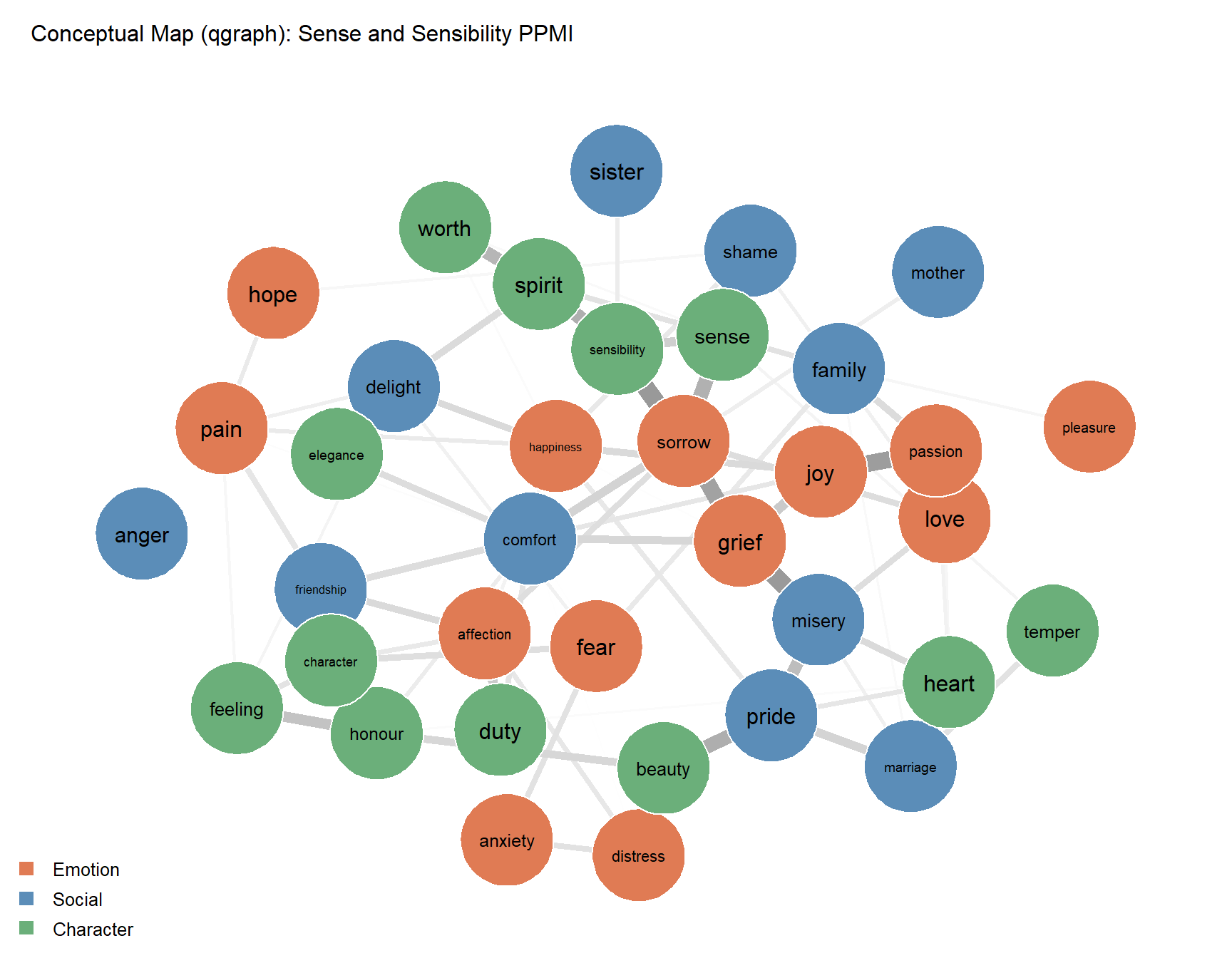
Epskamp, Sacha, Angélique OJ Cramer, Lourens J Waldorp, Verena D Schmittmann, and Denny Borsboom. 2012. “Qgraph: Network Visualizations of Relationships in Psychometric Data.” Journal of Statistical Software 48: 1–18.
Firth, John R. 1957. A Synopsis of Linguistic Theory, 1930-1955. Vol. Studies in linguistic analysis. Basil Blackwell.
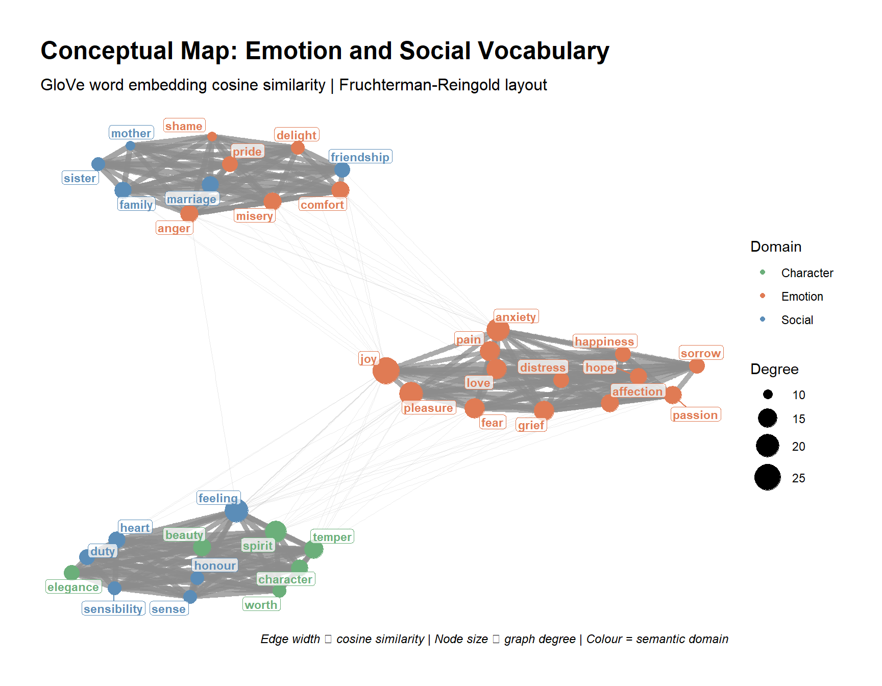
Fruchterman, Thomas MJ, and Edward M Reingold. 1991. “Graph Drawing by Force-Directed Placement.” Software: Practice and Experience 21 (11): 1129–64.
Harris, Zellig S. 1954. “Distributional Structure.” Word 10 (2-3): 146–62.
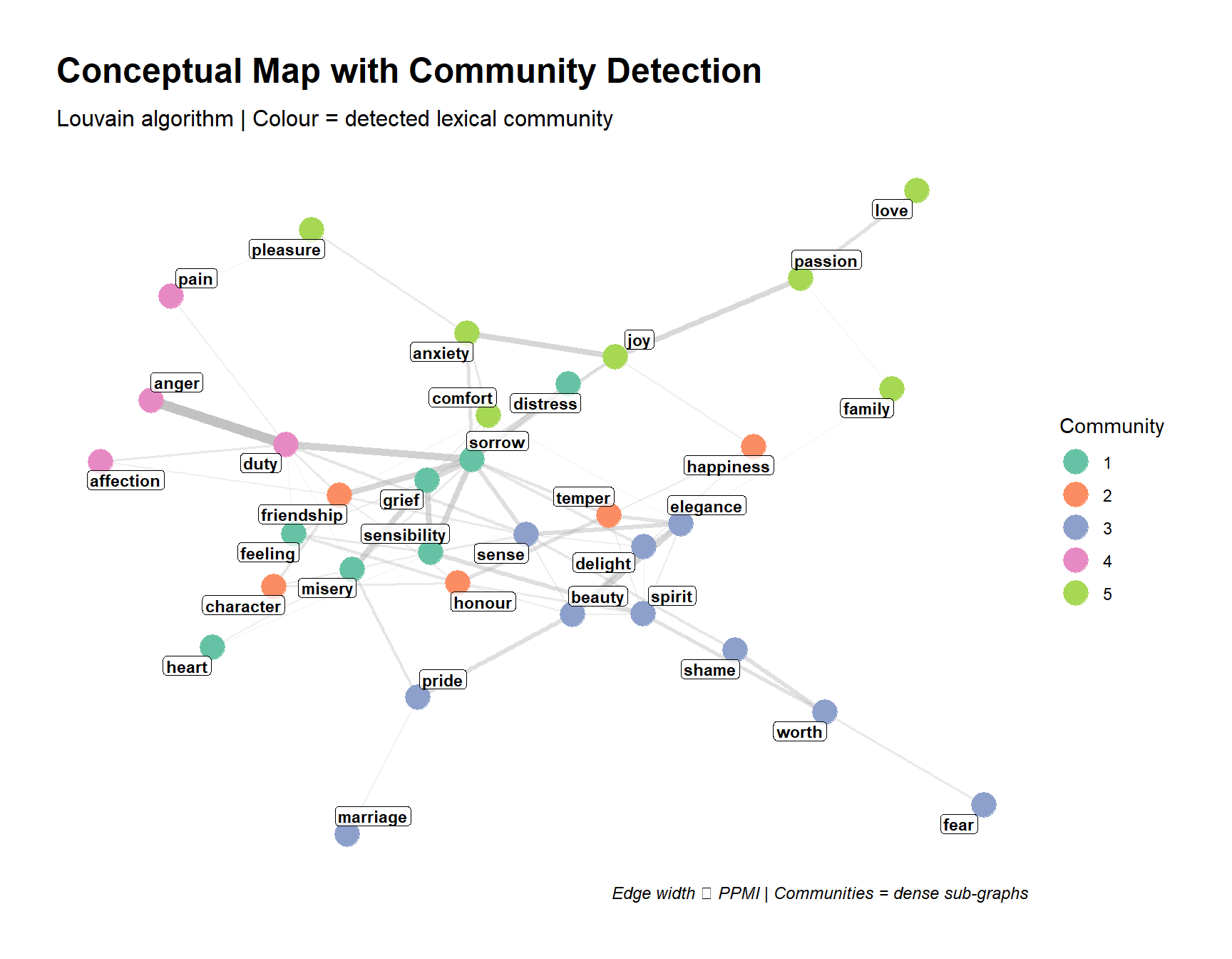
Hendrickx, Julien M, and V Blondel. 2008. “Graphs and Networks for the Analysis of Autonomous Agent Systems.” PhD thesis, Catholic University of Louvain, Louvain-la-Neuve, Belgium.
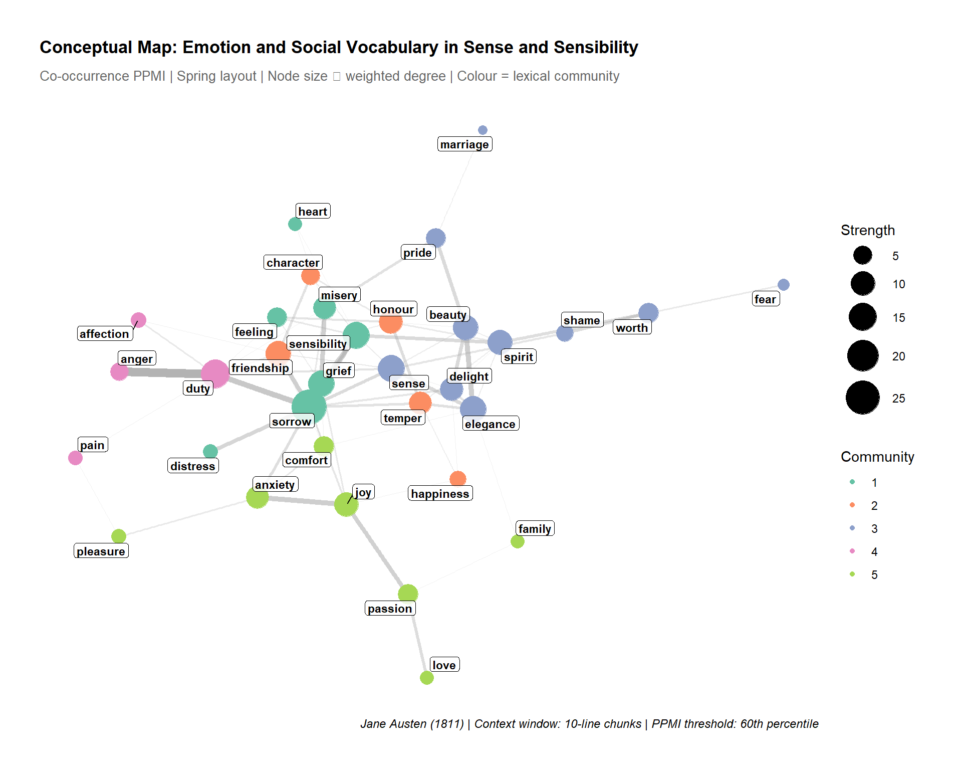
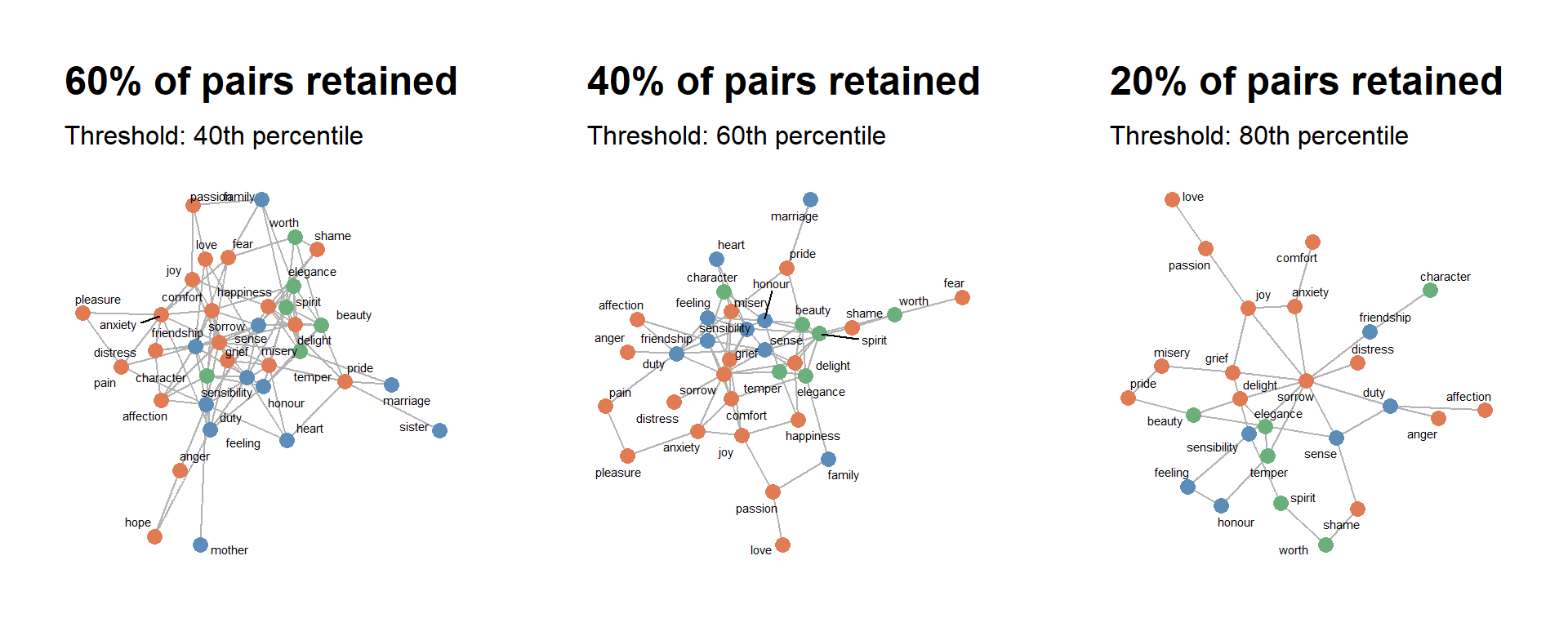
Schneider, Gerold. 2024. “The Visualisation and Evaluation of Semantic and Conceptual Maps.” Linguistics Across Disciplinary Borders: The March of Data. Bloomsbury Publishing (UK), London, 67–94.