This tutorial introduces interactive data visualisation in R — a set of techniques that allow readers to explore data directly within a web page or HTML document, rather than passively viewing a static figure. Interactive visualisations let users zoom, pan, filter, hover for details, and animate changes over time, making them especially well-suited to publishing research results online, building data dashboards, and communicating findings to non-specialist audiences.
Interactive graphics cannot be embedded in printed documents, but they are ideally suited to modern research outputs: websites, HTML reports, Quarto documents, R Markdown files, and Shiny apps. In applied linguistics and corpus linguistics, interactive visualisations are particularly useful for exploring large datasets — such as the diachronic frequencies of hundreds of lexical items — where static plots would be too crowded to read.
This tutorial covers four main tools, all of which produce self-contained HTML widgets that require no external server:
plotly(Sievert 2020) for interactive charts (scatter plots, line graphs, bar charts, bubble charts, histograms)
Martin Schweinberger. 2026. Interactive Visualizations in R. The Language Technology and Data Analysis Laboratory (LADAL), The University of Queensland, Australia. url: https://ladal.edu.au/tutorials/motion/motion.html (Version 2026.03.30).
Preparation and Session Set-up
Install required packages once:
Code
install.packages("plotly")install.packages("gganimate")install.packages("gapminder")install.packages("leaflet")install.packages("DT")install.packages("sf")install.packages("rnaturalearth") # world country polygonsinstall.packages("rnaturalearthdata") # data dependency for rnaturalearthinstall.packages("dplyr")install.packages("tidyr")install.packages("ggplot2")install.packages("flextable")install.packages("gifski") # required for gganimate GIF renderinginstall.packages("checkdown")
Load packages for this session:
Code
library(checkdown) # interactive exerciseslibrary(dplyr) # data manipulationlibrary(tidyr) # data reshapinglibrary(ggplot2) # static graphics (base for gganimate)library(gganimate) # animated ggplot2 graphicslibrary(gapminder) # gapminder datasetlibrary(plotly) # interactive chartslibrary(leaflet) # interactive mapslibrary(DT) # interactive tableslibrary(sf) # spatial data (replaces deprecated maptools)library(rnaturalearth) # world country polygonslibrary(rnaturalearthdata) # data dependency for rnaturalearthlibrary(flextable) # formatted static tables
The Linguistic Dataset
Throughout the charts and animations sections of this tutorial we use a dataset called coocdata, which records how often adjectives in a large historical corpus of English were amplified by various degree adverbs (such as very, really, totally) across different decades. This type of data arises in corpus-linguistic research on amplifier variation — the study of how intensifying degree adverbs compete with one another and how their frequencies change over time (Lorenz 2002).
The dataset allows us to track, for example, whether the share of very as an amplifier of a given adjective has increased or decreased over the decades — a classical question in diachronic corpus linguistics concerning the grammaticalisation and renewal of intensifiers. Visualising such diachronic change interactively is particularly useful because the corpus contains many adjectives, and a static plot would be too cluttered to interpret.
We process the data to calculate, for each adjective and decade, the percentage of occurrences amplified by very versus all other amplifiers combined. Adjectives amplified by neither are excluded.
What you will learn: How to create interactive scatter plots, line charts, bar charts, bubble charts, and histograms using plotly.
Key advantage:plotly charts are fully self-contained HTML widgets — hover effects, zoom, pan, and download buttons are included automatically with no extra code. They can be embedded directly in any Quarto or R Markdown document.
The plotly package (Sievert 2020) is the most widely used interactive graphics library for R. It works in two ways: you can either use plot_ly() to build charts directly with plotly syntax, or you can build a ggplot2 chart and convert it to an interactive version with a single call to ggplotly(). The latter approach is particularly useful because it means you can use the full power of ggplot2(Wickham 2016) for chart design and then add interactivity with minimal extra effort.
Scatter plots
A scatter plot is appropriate when you want to show the relationship between two continuous variables. Here we plot the mean percentage of very-amplification by decade.
Code
plot_ly( scdat,x =~Decade,y =~Percent_very,type ="scatter",mode ="markers",marker =list(size =10, color ="steelblue"),text =~paste0("Decade: ", Decade, "<br>% very: ", round(Percent_very, 1)),hoverinfo ="text") |>layout(title ="Mean percentage of 'very'-amplification by decade",xaxis =list(title ="Decade"),yaxis =list(title ="Mean % amplified by 'very'") )
Hover over any point to see the decade and percentage value. Use the toolbar in the top-right corner to zoom, pan, or download the figure.
Line charts
A line chart is appropriate for the same data when you want to emphasise continuity and trend over time. We add mode = "lines+markers" to show both the connecting line and the data points.
Bar charts are effective for comparing values across discrete categories. Note the interactive legend: click on categories to toggle their visibility.
Code
plot_ly( scdat,x =~Decade,y =~Percent_very,type ="bar",marker =list(color =~Percent_very,colorscale ="Blues",showscale =TRUE ),text =~paste0(round(Percent_very, 1), "%"),hoverinfo ="text+x") |>layout(title ="Percentage of 'very'-amplification by decade",xaxis =list(title ="Decade"),yaxis =list(title ="Mean % amplified by 'very'") )
Bubble charts
Bubble charts add a third dimension to a scatter plot by encoding a third variable as the size of each point. Here we use the adjective-level data: each bubble represents one adjective in one decade. The x-axis shows the decade, the y-axis the percentage amplified by very, and the bubble size the total frequency of that adjective in the corpus.
Code
# use a sample of adjectives to avoid overplottingbubble_data <- coocs |> dplyr::filter(Adjective %in%c("good", "great", "nice", "bad","big", "old", "new", "long")) |> dplyr::filter(!is.na(Frequency_Adjective))plot_ly( bubble_data,x =~Decade,y =~Percent_very,size =~Frequency_Adjective,color =~Adjective,type ="scatter",mode ="markers",sizes =c(5, 50),text =~paste0(Adjective, "<br>Decade: ", Decade,"<br>% very: ", Percent_very,"<br>Freq: ", Frequency_Adjective),hoverinfo ="text") |>layout(title ="Amplification by 'very' across adjectives and decades",xaxis =list(title ="Decade"),yaxis =list(title ="% amplified by 'very'"),legend =list(title =list(text ="Adjective")) )
Click on adjective names in the legend to show or hide individual items. The bubble size reflects how frequently the adjective appeared in the corpus — larger bubbles indicate more data.
Histograms
Histograms are appropriate for visualising the distribution of a single continuous variable. Here we show the distribution of very-amplification percentages across all adjectives and decades.
Code
plot_ly( coocs |> dplyr::filter(!is.na(Percent_very)),x =~Percent_very,type ="histogram",nbinsx =30,marker =list(color ="steelblue", line =list(color ="white", width =0.5))) |>layout(title ="Distribution of 'very'-amplification percentages",xaxis =list(title ="% amplified by 'very'"),yaxis =list(title ="Count") )
ggplot2 to plotly with ggplotly()
Any ggplot2 plot can be converted to an interactive plotly chart with a single call to ggplotly(). This is the easiest way to add interactivity to an existing static plot:
p <-ggplot(scdat, aes(x = Decade, y = Percent_very)) +geom_line(colour ="steelblue") +geom_point(size =3) +labs(title ="Diachronic trend: 'very'",x ="Decade", y ="% amplified by 'very'") +theme_bw()ggplotly(p)
Exercises: Interactive Charts
Q1. What is the key advantage of ggplotly() over building a chart directly with plot_ly()?
Q2. When is a bubble chart more informative than a standard scatter plot?
Animations
Section Overview
What you will learn: How to create animated graphics that transition through time using gganimate, and how to build an animated bubble plot using plotly.
Key concept: Animation is most appropriate when you have a temporal variable and want to show how a distribution or relationship changes over time — as opposed to a static faceted plot where all time points are shown simultaneously.
Animations are particularly powerful for communicating diachronic change. Rather than presenting all time points at once in a cluttered facet grid, an animation guides the viewer’s attention sequentially through the data.
Animations with gganimate
The gganimate package (Pedersen and Robinson 2022) extends ggplot2(Wickham 2016) with a grammar of animation. You build a standard ggplot2 plot and then add one of several transition_*() functions to specify how the data should change across frames. The most common is transition_time(), which transitions between observations at different values of a time variable.
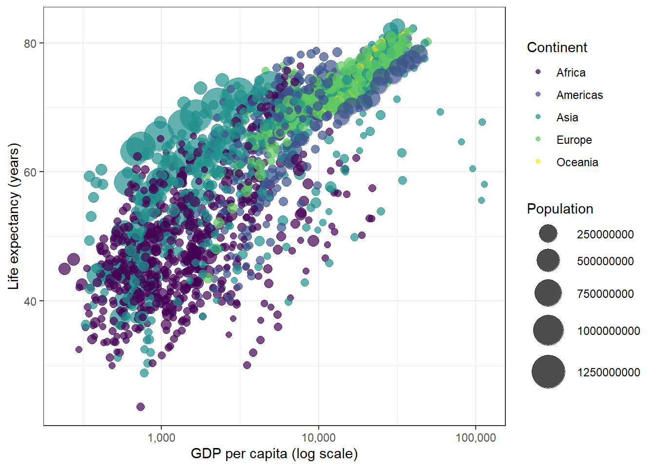
We use the gapminder dataset, which contains data on life expectancy, GDP per capita, and population for countries around the world from 1952 to 2007. This is a classic dataset for animated visualisation because the trends over time are striking and interpretable.
country
continent
year
lifeExp
pop
gdpPercap
Afghanistan
Asia
1,952
28.801
8,425,333
779.4453145
Afghanistan
Asia
1,957
30.332
9,240,934
820.8530296
Afghanistan
Asia
1,962
31.997
10,267,083
853.1007100
Afghanistan
Asia
1,967
34.020
11,537,966
836.1971382
Afghanistan
Asia
1,972
36.088
13,079,460
739.9811058
Afghanistan
Asia
1,977
38.438
14,880,372
786.1133600
Afghanistan
Asia
1,982
39.854
12,881,816
978.0114388
Afghanistan
Asia
1,987
40.822
13,867,957
852.3959448
Afghanistan
Asia
1,992
41.674
16,317,921
649.3413952
Afghanistan
Asia
1,997
41.763
22,227,415
635.3413510
We begin with a static snapshot to verify the plot looks correct before animating it:
Now we add the animation. transition_time(year) tells gganimate to step through the data one year at a time. The {frame_time} label in the title updates automatically with the current year displayed.
gganimate produces animations by rendering many frames of a ggplot2 plot and combining them. The default output is a GIF via the gifski package (install with install.packages("gifski")). You can save the animation with anim_save("my_animation.gif"). Inside a Quarto document, setting eval=FALSE and displaying a pre-rendered GIF (as above) is the most reliable approach, since rendering many frames in a knit session can be slow.
Additional gganimate example: diachronic bar chart
Here we apply animation to the linguistic data. We animate a bar chart showing the mean very-amplification percentage across decades, so the viewer watches the bar rise and fall over time.
plotly also supports animation via the frame argument. Setting frame = ~year creates an animated plot where pressing the play button steps through one frame per year. Unlike GIF-based animations, plotly animations are fully interactive: you can pause, scrub to any frame, and hover over individual points.
Code
gapminder |>plot_ly(x =~gdpPercap,y =~lifeExp,size =~pop,color =~continent,frame =~year,text =~country,hoverinfo ="text",type ="scatter",mode ="markers",sizes =c(5, 60) ) |>layout(xaxis =list(type ="log", title ="GDP per capita (log scale)"),yaxis =list(title ="Life expectancy (years)"),title ="Global development: GDP vs life expectancy over time" ) |>animation_opts(frame =100, easing ="linear", redraw =FALSE) |>animation_button(x =1, xanchor ="right", y =0, yanchor ="bottom")
Press the Play button to start the animation. Hover over any bubble to see the country name.
Exercises: Animations
Q1. What does the transition_time() function in gganimate do?
Q2. What is the key difference between a gganimate GIF animation and a plotly animated chart?
Interactive Maps
Section Overview
What you will learn: How to build interactive maps using leaflet: a simple tile-based map, a map with custom markers and popups, and a choropleth world map with colour-coded country polygons using sf data.
The leaflet package wraps the popular Leaflet.js JavaScript library for R. It produces interactive web maps that support zoom, pan, markers, popups, polygons, and legends — all without any JavaScript knowledge required. The sf package (Pebesma 2018) provides the modern R framework for handling spatial vector data (points, lines, polygons), replacing older packages such as sp and maptools.
Basic tile map
The simplest leaflet map loads a tile layer (a background map from a provider such as OpenStreetMap) and centres the view on a location. Here we centre on Brisbane.
Code
leaflet() |>setView(lng =153.05, lat =-27.45, zoom =12) |>addTiles()
Use the + / - buttons or scroll wheel to zoom in and out. Click and drag to pan.
Map with markers and popups
Markers identify specific locations. Popups display information when a marker is clicked. Here we add markers for the five main campuses of The University of Queensland.
Code
uq_campuses <-data.frame(name =c("St Lucia (main campus)", "Gatton", "Herston","Dutton Park", "Stradbroke Island"),lat =c(-27.4975, -27.5441, -27.4530, -27.4993, -27.4944),lng =c(153.0137, 152.3375, 153.0280, 153.0270, 153.4282),info =c("Main campus — home of LADAL","Agricultural and veterinary sciences","Medical and health sciences","Oral health centre","Research station on Minjerribah" ))leaflet(uq_campuses) |>setView(lng =152.7, lat =-27.5, zoom =8) |>addTiles() |>addMarkers(lng =~lng,lat =~lat,popup =~paste0("<b>", name, "</b><br>", info),label =~name )
Click any marker to open its popup. Hover over a marker to see its label.
Custom marker colours
Different marker colours help distinguish categories. Here we use coloured circle markers to distinguish LADAL tutorial topics across three UQ locations.
A choropleth map colours geographic regions by the value of a variable. We use rnaturalearth::ne_countries() to load world country polygons as an sf object, calculate population density from the built-in population estimate column, and display it as an interactive choropleth with leaflet.
Code
# Load world country polygons from rnaturalearth# Requires: install.packages(c("rnaturalearth", "rnaturalearthdata"))world <- rnaturalearth::ne_countries(scale ="medium", returnclass ="sf")# Calculate population density (people per km²) using sf area calculationworld <- world |> dplyr::mutate(area_km2 =as.numeric(sf::st_area(geometry)) /1e6,pop_density =round(pop_est / area_km2, 2),pop_density = dplyr::if_else(is.infinite(pop_density) |is.nan(pop_density),NA_real_, pop_density) )# Colour palette: quantile-based so variation is visible across the full rangepal <-colorQuantile(palette =rev(viridis::viridis(10)),domain = world$pop_density,n =10,na.color ="#cccccc")# Build the mapleaflet(world) |>setView(lng =0, lat =20, zoom =2) |>addTiles() |>addPolygons(fillColor =~pal(pop_density),fillOpacity =0.8,color ="#333333",weight =0.5,opacity =1,label =~paste0(name_long, ": ",ifelse(is.na(pop_density), "no data",paste0(formatC(pop_density, format ="f",digits =1), " per km\u00b2"))),labelOptions =labelOptions(direction ="auto"),highlightOptions =highlightOptions(color ="#000000",weight =2,bringToFront =TRUE ) ) |>addLegend(position ="bottomright",pal = pal,values =~pop_density,title ="Population density<br>(decile)",opacity =0.8 )
Hover over any country to see its name and population density. The colour scale uses quantiles so that variation is visible even where most countries have low densities.
Exercises: Interactive Maps
Q1. What is the role of addTiles() in a leaflet map?
Q2. Why is a quantile-based colour scale (colorQuantile()) often preferred over a linear colour scale for choropleth maps?
Interactive Tables with DT
Section Overview
What you will learn: How to create interactive, searchable, sortable data tables using the DT package — a particularly useful tool for sharing corpus linguistic results where readers may want to filter and explore a large output table.
Key advantage: A DT table requires no additional coding beyond a single function call and works in any HTML output format. It is ideal for supplementary data tables in online publications.
The DT package provides an R interface to the DataTables JavaScript library. A datatable() call wraps any R data frame in a fully interactive HTML table with built-in search, column sorting, pagination, and optional download buttons. This is particularly valuable in corpus linguistics and lexicography, where results tables — concordance lines, frequency lists, collocations, dictionary entries — may contain hundreds or thousands of rows.
Basic interactive table
Here we display the processed coocs amplifier dataset as an interactive table. Every column is immediately sortable by clicking the column header; the search box filters across all columns simultaneously.
Use the search boxes at the top of each column to filter by decade, adjective, or frequency range. Click any column header to sort ascending or descending.
Table with conditional formatting
We can add visual formatting — such as colour bars or highlighting — to draw attention to notable values. Here we colour the % very column with a gradient from white to steelblue.
For sharing results with collaborators, you can add buttons that allow users to download the table as a CSV, Excel, or PDF file directly from the web page:
Q1. What is the main advantage of a DT::datatable() table over a standard flextable() or knitr::kable() table in an HTML document?
Citation & Session Info
Citation
Martin Schweinberger. 2026. Interactive Visualizations in R. The Language Technology and Data Analysis Laboratory (LADAL), The University of Queensland, Australia. url: https://ladal.edu.au/tutorials/motion/motion.html (Version 2026.03.29).
@manual{martinschweinberger2026interactive,
  author       = {Martin Schweinberger},
  title        = {Interactive Visualizations in R},
  year         = {2026},
  note         = {https://ladal.edu.au/tutorials/motion/motion.html},
  organization = {The Language Technology and Data Analysis Laboratory (LADAL), The University of Queensland, Australia},
  edition      = {2026.03.29},
  doi          = {}
}
This tutorial was re-developed with the assistance of Claude (claude.ai), a large language model created by Anthropic. Claude was used to help revise the tutorial text, structure the instructional content, generate the R code examples, and write the checkdown quiz questions and feedback strings. All content was reviewed, edited, and approved by the author (Martin Schweinberger), who takes full responsibility for the accuracy and pedagogical appropriateness of the material. The use of AI assistance is disclosed here in the interest of transparency and in accordance with emerging best practices for AI-assisted academic content creation.
Cheng, Joe, Bhaskar Karambelkar, and Yihui Xie. 2023. Leaflet: Create Interactive Web Maps with the JavaScript ’Leaflet’ Library. https://CRAN.R-project.org/package=leaflet.
Lorenz, Gunter. 2002. “Really Worthwhile or Not Really Significant? A Corpus-Based Approach to the Delexicalization and Grammaticalization of Intensifiers in Modern English.” In New Reflections on Grammaticalization, edited by Ilse Wischer and Gabriele Diewald, 49:143–61. Typological Studies in Language. Amsterdam; Philadelphia: John Benjamins. https://doi.org/10.1075/tsl.49.11lor.
Pebesma, Edzer. 2018. “Simple Features for R: Standardized Support for Spatial Vector Data.”The R Journal 10 (1): 439–46. https://doi.org/10.32614/RJ-2018-009.
Sievert, Carson. 2020. Interactive Web-Based Data Visualization with R, Plotly, and Shiny. Boca Raton, FL: Chapman; Hall/CRC. https://doi.org/10.1201/9780429447273.
Wickham, Hadley. 2016. Ggplot2: Elegant Graphics for Data Analysis. Springer-Verlag New York. https://ggplot2.tidyverse.org.
Source Code
---title: "Interactive Visualizations in R"author: "Martin Schweinberger"date: "2026"params: title: "Interactive Visualizations in R" author: "Martin Schweinberger" year: "2026" version: "2026.03.29" url: "https://ladal.edu.au/tutorials/motion/motion.html" institution: "The Language Technology and Data Analysis Laboratory (LADAL), The University of Queensland, Australia" description: "This tutorial introduces interactive data visualisation in R using plotly, gganimate, leaflet, and DT. It covers interactive charts, animated graphics, interactive maps, and interactive tables, with a focus on practical application to linguistic data." doi: ""format: html: toc: true toc-depth: 4 code-fold: show code-tools: true theme: cosmo---```{r setup, echo=FALSE, message=FALSE, warning=FALSE}library(checkdown)library(dplyr)library(tidyr)library(ggplot2)library(gganimate)library(gapminder)library(plotly)library(leaflet)library(DT)library(flextable)library(sf)options(stringsAsFactors = FALSE)options("scipen" = 100, "digits" = 12)```{ width=100% }# Introduction {#intro}{ width=15% style="float:right; padding:10px" }This tutorial introduces **interactive data visualisation in R** — a set of techniques that allow readers to explore data directly within a web page or HTML document, rather than passively viewing a static figure. Interactive visualisations let users zoom, pan, filter, hover for details, and animate changes over time, making them especially well-suited to publishing research results online, building data dashboards, and communicating findings to non-specialist audiences.Interactive graphics cannot be embedded in printed documents, but they are ideally suited to modern research outputs: websites, HTML reports, Quarto documents, R Markdown files, and Shiny apps. In applied linguistics and corpus linguistics, interactive visualisations are particularly useful for exploring large datasets — such as the diachronic frequencies of hundreds of lexical items — where static plots would be too crowded to read.This tutorial covers four main tools, all of which produce self-contained HTML widgets that require no external server:- **`plotly`** [@sievert2020plotly] for interactive charts (scatter plots, line graphs, bar charts, bubble charts, histograms)- **`gganimate`** [@pedersen2022gganimate] for animated `ggplot2` graphics that transition through time- **`leaflet`** [@cheng2023leaflet] for interactive maps with zoom, pan, markers, and popups- **`DT`** for interactive, searchable, sortable data tables::: {.callout-note}## Learning ObjectivesBy the end of this tutorial you will be able to:1. Explain what interactive visualisation is and when it is appropriate to use it2. Create interactive scatter plots, line charts, bar charts, bubble charts, and histograms using `plotly`3. Convert a static `ggplot2` graphic into an animated GIF using `gganimate`4. Create animated bubble plots that transition through time using `plotly`5. Build interactive maps with tile layers, custom markers, popups, and colour-coded polygon layers using `leaflet`6. Display world map data with choropleth colouring using `sf` and `leaflet`7. Create interactive, searchable, sortable data tables using `DT`8. Embed interactive visualisations in Quarto and R Markdown documents:::::: {.callout-note}## Prerequisite TutorialsBefore working through this tutorial, we recommend familiarity with the following:- [Getting Started with R](/tutorials/intror/intror.html)- [Loading, Saving, and Generating Data in R](/tutorials/load/load.html)- [Handling Tables in R](/tutorials/table/table.html)- [Introduction to Data Visualization](/tutorials/introviz/introviz.html)- [Mastering Data Visualization with R](/tutorials/dviz/dviz.html):::::: {.callout-note}## Citation```{r citation-callout-top, echo=FALSE, results='asis'}cat( params$author, ". ", params$year, ". *", params$title, "*. ", params$institution, ". ", "url: ", params$url, " ", "(Version ", params$version, ").", sep = "")```:::## Preparation and Session Set-up {-}Install required packages once:```{r prep1, echo=TRUE, eval=FALSE, message=FALSE, warning=FALSE}install.packages("plotly")install.packages("gganimate")install.packages("gapminder")install.packages("leaflet")install.packages("DT")install.packages("sf")install.packages("rnaturalearth") # world country polygonsinstall.packages("rnaturalearthdata") # data dependency for rnaturalearthinstall.packages("dplyr")install.packages("tidyr")install.packages("ggplot2")install.packages("flextable")install.packages("gifski") # required for gganimate GIF renderinginstall.packages("checkdown")```Load packages for this session:```{r prep2, echo=TRUE, message=FALSE, warning=FALSE}library(checkdown) # interactive exerciseslibrary(dplyr) # data manipulationlibrary(tidyr) # data reshapinglibrary(ggplot2) # static graphics (base for gganimate)library(gganimate) # animated ggplot2 graphicslibrary(gapminder) # gapminder datasetlibrary(plotly) # interactive chartslibrary(leaflet) # interactive mapslibrary(DT) # interactive tableslibrary(sf) # spatial data (replaces deprecated maptools)library(rnaturalearth) # world country polygonslibrary(rnaturalearthdata) # data dependency for rnaturalearthlibrary(flextable) # formatted static tables```---## The Linguistic Dataset {-}Throughout the charts and animations sections of this tutorial we use a dataset called `coocdata`, which records how often adjectives in a large historical corpus of English were amplified by various degree adverbs (such as *very*, *really*, *totally*) across different decades. This type of data arises in corpus-linguistic research on **amplifier variation** — the study of how intensifying degree adverbs compete with one another and how their frequencies change over time [@lorenz2002intensifiers].The dataset allows us to track, for example, whether the share of *very* as an amplifier of a given adjective has increased or decreased over the decades — a classical question in diachronic corpus linguistics concerning the grammaticalisation and renewal of intensifiers. Visualising such diachronic change interactively is particularly useful because the corpus contains many adjectives, and a static plot would be too cluttered to interpret.```{r mc1, message=FALSE, warning=FALSE}# load datacoocdata <- base::readRDS("tutorials/motion/data/coo.rda", "rb")``````{r mc2, echo=FALSE, message=FALSE, warning=FALSE}coocdata |> as.data.frame() |> head(15) |> flextable() |> flextable::set_table_properties(width = .95, layout = "autofit") |> flextable::theme_zebra() |> flextable::fontsize(size = 12) |> flextable::fontsize(size = 12, part = "header") |> flextable::align_text_col(align = "center") |> flextable::set_caption(caption = "First 15 rows of the coocdata dataset.") |> flextable::border_outer()```We process the data to calculate, for each adjective and decade, the percentage of occurrences amplified by *very* versus all other amplifiers combined. Adjectives amplified by neither are excluded.```{r mc3, message=FALSE, warning=FALSE}coocs <- coocdata |> dplyr::select(Decade, Amp, Adjective, OBS) |> dplyr::rename(Frequency = OBS, Amplifier = Amp) |> dplyr::mutate(Amplifier = ifelse(Amplifier == "very", "very", "other")) |> dplyr::group_by(Decade, Adjective, Amplifier) |> dplyr::summarise(Frequency = sum(Frequency), .groups = "drop") |> tidyr::spread(Amplifier, Frequency) |> dplyr::group_by(Decade, Adjective) |> dplyr::mutate( Frequency_Adjective = sum(other + very, na.rm = TRUE), Percent_very = round(very / (other + very) * 100, 2) ) |> dplyr::mutate( Percent_very = ifelse(is.na(Percent_very), 0, Percent_very), Adjective = factor(Adjective) )``````{r mc3b, echo=FALSE, message=FALSE, warning=FALSE}coocs |> as.data.frame() |> head(10) |> flextable() |> flextable::set_table_properties(width = .95, layout = "autofit") |> flextable::theme_zebra() |> flextable::fontsize(size = 12) |> flextable::fontsize(size = 12, part = "header") |> flextable::align_text_col(align = "center") |> flextable::set_caption(caption = "First 10 rows of the processed coocs dataset.") |> flextable::border_outer()```We also create a decade-level summary for use in the simpler chart examples:```{r mc4, message=FALSE, warning=FALSE}scdat <- coocs |> dplyr::group_by(Decade) |> dplyr::summarise(Percent_very = mean(Percent_very, na.rm = TRUE), .groups = "drop")```---# Interactive Charts with plotly {#charts}::: {.callout-note}## Section Overview**What you will learn:** How to create interactive scatter plots, line charts, bar charts, bubble charts, and histograms using `plotly`.**Key advantage:** `plotly` charts are fully self-contained HTML widgets — hover effects, zoom, pan, and download buttons are included automatically with no extra code. They can be embedded directly in any Quarto or R Markdown document.:::The `plotly` package [@sievert2020plotly] is the most widely used interactive graphics library for R. It works in two ways: you can either use `plot_ly()` to build charts directly with plotly syntax, or you can build a `ggplot2` chart and convert it to an interactive version with a single call to `ggplotly()`. The latter approach is particularly useful because it means you can use the full power of `ggplot2`[@wickham2016ggplot2] for chart design and then add interactivity with minimal extra effort.## Scatter plots {-}A scatter plot is appropriate when you want to show the relationship between two continuous variables. Here we plot the mean percentage of *very*-amplification by decade.```{r mc5, message=FALSE, warning=FALSE}plot_ly( scdat, x = ~Decade, y = ~Percent_very, type = "scatter", mode = "markers", marker = list(size = 10, color = "steelblue"), text = ~paste0("Decade: ", Decade, "<br>% very: ", round(Percent_very, 1)), hoverinfo = "text") |> layout( title = "Mean percentage of 'very'-amplification by decade", xaxis = list(title = "Decade"), yaxis = list(title = "Mean % amplified by 'very'") )```Hover over any point to see the decade and percentage value. Use the toolbar in the top-right corner to zoom, pan, or download the figure.## Line charts {-}A line chart is appropriate for the same data when you want to emphasise continuity and trend over time. We add `mode = "lines+markers"` to show both the connecting line and the data points.```{r mc6, message=FALSE, warning=FALSE}plot_ly( scdat, x = ~Decade, y = ~Percent_very, type = "scatter", mode = "lines+markers", line = list(color = "steelblue", width = 2), marker = list(size = 8, color = "steelblue"), text = ~paste0("Decade: ", Decade, "<br>% very: ", round(Percent_very, 1)), hoverinfo = "text") |> layout( title = "Diachronic trend: 'very'-amplification across decades", xaxis = list(title = "Decade"), yaxis = list(title = "Mean % amplified by 'very'") )```## Bar charts {-}Bar charts are effective for comparing values across discrete categories. Note the interactive legend: click on categories to toggle their visibility.```{r mc7, message=FALSE, warning=FALSE}plot_ly( scdat, x = ~Decade, y = ~Percent_very, type = "bar", marker = list( color = ~Percent_very, colorscale = "Blues", showscale = TRUE ), text = ~paste0(round(Percent_very, 1), "%"), hoverinfo = "text+x") |> layout( title = "Percentage of 'very'-amplification by decade", xaxis = list(title = "Decade"), yaxis = list(title = "Mean % amplified by 'very'") )```## Bubble charts {-}Bubble charts add a third dimension to a scatter plot by encoding a third variable as the size of each point. Here we use the adjective-level data: each bubble represents one adjective in one decade. The x-axis shows the decade, the y-axis the percentage amplified by *very*, and the bubble size the total frequency of that adjective in the corpus.```{r mc8, message=FALSE, warning=FALSE}# use a sample of adjectives to avoid overplottingbubble_data <- coocs |> dplyr::filter(Adjective %in% c("good", "great", "nice", "bad", "big", "old", "new", "long")) |> dplyr::filter(!is.na(Frequency_Adjective))plot_ly( bubble_data, x = ~Decade, y = ~Percent_very, size = ~Frequency_Adjective, color = ~Adjective, type = "scatter", mode = "markers", sizes = c(5, 50), text = ~paste0(Adjective, "<br>Decade: ", Decade, "<br>% very: ", Percent_very, "<br>Freq: ", Frequency_Adjective), hoverinfo = "text") |> layout( title = "Amplification by 'very' across adjectives and decades", xaxis = list(title = "Decade"), yaxis = list(title = "% amplified by 'very'"), legend = list(title = list(text = "Adjective")) )```Click on adjective names in the legend to show or hide individual items. The bubble size reflects how frequently the adjective appeared in the corpus — larger bubbles indicate more data.## Histograms {-}Histograms are appropriate for visualising the distribution of a single continuous variable. Here we show the distribution of *very*-amplification percentages across all adjectives and decades.```{r mc9, message=FALSE, warning=FALSE}plot_ly( coocs |> dplyr::filter(!is.na(Percent_very)), x = ~Percent_very, type = "histogram", nbinsx = 30, marker = list(color = "steelblue", line = list(color = "white", width = 0.5))) |> layout( title = "Distribution of 'very'-amplification percentages", xaxis = list(title = "% amplified by 'very'"), yaxis = list(title = "Count") )```::: {.callout-tip}## ggplot2 to plotly with ggplotly()Any `ggplot2` plot can be converted to an interactive plotly chart with a single call to `ggplotly()`. This is the easiest way to add interactivity to an existing static plot:```rp <-ggplot(scdat, aes(x = Decade, y = Percent_very)) +geom_line(colour ="steelblue") +geom_point(size =3) +labs(title ="Diachronic trend: 'very'",x ="Decade", y ="% amplified by 'very'") +theme_bw()ggplotly(p)```:::---::: {.callout-tip}## Exercises: Interactive Charts:::**Q1. What is the key advantage of `ggplotly()` over building a chart directly with `plot_ly()`?**```{r}#| echo: false#| label: "CHART_Q1"check_question("ggplotly() converts an existing ggplot2 chart to an interactive plotly chart with a single line of code, allowing you to use the full ggplot2 API for chart design and then add interactivity at the end",options =c("ggplotly() converts an existing ggplot2 chart to an interactive plotly chart with a single line of code, allowing you to use the full ggplot2 API for chart design and then add interactivity at the end","ggplotly() produces higher-resolution graphics than plot_ly()","ggplotly() works without an internet connection, whereas plot_ly() requires one","ggplotly() automatically saves the chart as a PNG file" ),type ="radio",q_id ="CHART_Q1",random_answer_order =TRUE,button_label ="Check answer",right ="Correct! ggplotly() is a bridge between the familiar ggplot2 API and plotly's interactivity. If you already have a ggplot2 chart you are happy with, you can make it interactive with just ggplotly(your_plot). This is often faster than rebuilding the chart from scratch with plot_ly(), especially for complex multi-layer plots.",wrong ="Think about workflow efficiency. If you already know ggplot2 well, what would be the fastest route to adding interactivity to an existing plot?")```**Q2. When is a bubble chart more informative than a standard scatter plot?**```{r}#| echo: false#| label: "CHART_Q2"check_question("When you have three variables to display simultaneously: the bubble size encodes a third numeric variable, allowing you to show an additional dimension without adding a separate facet or panel",options =c("When you have three variables to display simultaneously: the bubble size encodes a third numeric variable, allowing you to show an additional dimension without adding a separate facet or panel","When the data contains more than 1000 observations, as bubbles are more visible than points","When all observations have the same value on the y-axis","Bubble charts are never more informative than scatter plots; they just look more visually appealing" ),type ="radio",q_id ="CHART_Q2",random_answer_order =TRUE,button_label ="Check answer",right ="Correct! A bubble chart is essentially a scatter plot with a third encoding: point size represents the magnitude of a third variable. In our example, x = decade, y = % amplified by 'very', and size = corpus frequency. This allows three dimensions of information to be read from a single plot. The tradeoff is that size is a less precise encoding than position, so bubble charts work best when precise comparison of the third variable is not critical.",wrong ="Think about what a bubble chart adds relative to a standard scatter plot. What information does the size of each bubble encode?")```---# Animations {#animations}::: {.callout-note}## Section Overview**What you will learn:** How to create animated graphics that transition through time using `gganimate`, and how to build an animated bubble plot using `plotly`.**Key concept:** Animation is most appropriate when you have a temporal variable and want to show how a distribution or relationship *changes* over time — as opposed to a static faceted plot where all time points are shown simultaneously.:::Animations are particularly powerful for communicating diachronic change. Rather than presenting all time points at once in a cluttered facet grid, an animation guides the viewer's attention sequentially through the data.## Animations with gganimate {-}The `gganimate` package [@pedersen2022gganimate] extends `ggplot2`[@wickham2016ggplot2] with a grammar of animation. You build a standard `ggplot2` plot and then add one of several `transition_*()` functions to specify how the data should change across frames. The most common is `transition_time()`, which transitions between observations at different values of a time variable.We use the `gapminder` dataset, which contains data on life expectancy, GDP per capita, and population for countries around the world from 1952 to 2007. This is a classic dataset for animated visualisation because the trends over time are striking and interpretable.```{r an1b, echo=FALSE, message=FALSE, warning=FALSE}gapminder |> as.data.frame() |> head(10) |> flextable() |> flextable::set_table_properties(width = .95, layout = "autofit") |> flextable::theme_zebra() |> flextable::fontsize(size = 12) |> flextable::fontsize(size = 12, part = "header") |> flextable::align_text_col(align = "center") |> flextable::set_caption(caption = "First 10 rows of the gapminder dataset.") |> flextable::border_outer()```We begin with a static snapshot to verify the plot looks correct before animating it:```{r an2, message=FALSE, warning=FALSE}p <- ggplot( gapminder, aes(x = gdpPercap, y = lifeExp, size = pop, colour = continent)) + geom_point(alpha = 0.7) + scale_colour_viridis_d() + scale_size(range = c(2, 12)) + scale_x_log10(labels = scales::comma) + labs( x = "GDP per capita (log scale)", y = "Life expectancy (years)", colour = "Continent", size = "Population" ) + theme_bw()p```Now we add the animation. `transition_time(year)` tells gganimate to step through the data one year at a time. The `{frame_time}` label in the title updates automatically with the current year displayed.```{r an3, eval=FALSE, message=FALSE, warning=FALSE}anim <- p + transition_time(year) + labs(title = "Year: {frame_time}") + ease_aes("linear")animate(anim, nframes = 100, fps = 10, width = 700, height = 500)```::: {.callout-note}## Rendering gganimate Animations`gganimate` produces animations by rendering many frames of a `ggplot2` plot and combining them. The default output is a GIF via the `gifski` package (install with `install.packages("gifski")`). You can save the animation with `anim_save("my_animation.gif")`. Inside a Quarto document, setting `eval=FALSE` and displaying a pre-rendered GIF (as above) is the most reliable approach, since rendering many frames in a knit session can be slow.:::## Additional gganimate example: diachronic bar chart {-}Here we apply animation to the linguistic data. We animate a bar chart showing the mean *very*-amplification percentage across decades, so the viewer watches the bar rise and fall over time.```{r an4, eval=FALSE, message=FALSE, warning=FALSE}bar_anim <- ggplot(scdat, aes(x = "very", y = Percent_very, fill = Percent_very)) + geom_col(width = 0.5) + scale_fill_gradient(low = "lightblue", high = "steelblue") + labs( title = "Decade: {closest_state}", x = NULL, y = "Mean % amplified by 'very'", fill = "% very" ) + ylim(0, 100) + theme_bw() + theme(legend.position = "none") + transition_states(Decade, transition_length = 2, state_length = 1) + enter_fade() + exit_fade()animate(bar_anim, nframes = 80, fps = 8, width = 400, height = 400)```## Animated bubble plot with plotly {-}`plotly` also supports animation via the `frame` argument. Setting `frame = ~year` creates an animated plot where pressing the play button steps through one frame per year. Unlike GIF-based animations, plotly animations are fully interactive: you can pause, scrub to any frame, and hover over individual points.```{r an5, message=FALSE, warning=FALSE}gapminder |> plot_ly( x = ~gdpPercap, y = ~lifeExp, size = ~pop, color = ~continent, frame = ~year, text = ~country, hoverinfo = "text", type = "scatter", mode = "markers", sizes = c(5, 60) ) |> layout( xaxis = list(type = "log", title = "GDP per capita (log scale)"), yaxis = list(title = "Life expectancy (years)"), title = "Global development: GDP vs life expectancy over time" ) |> animation_opts(frame = 100, easing = "linear", redraw = FALSE) |> animation_button(x = 1, xanchor = "right", y = 0, yanchor = "bottom")```Press the **Play** button to start the animation. Hover over any bubble to see the country name.---::: {.callout-tip}## Exercises: Animations:::**Q1. What does the `transition_time()` function in `gganimate` do?**```{r}#| echo: false#| label: "ANIM_Q1"check_question("It animates the plot by stepping through observations at different values of a continuous time variable, creating one frame per time point and smoothly tweening between them",options =c("It animates the plot by stepping through observations at different values of a continuous time variable, creating one frame per time point and smoothly tweening between them","It pauses the animation at each frame for a set number of seconds","It synchronises the animation with a system clock so the plot runs in real time","It filters the data to only show observations from the current year" ),type ="radio",q_id ="ANIM_Q1",random_answer_order =TRUE,button_label ="Check answer",right ="Correct! transition_time() is the main workhorse for time-series animation in gganimate. It takes a continuous variable (typically a year or date) and creates a separate frame for each unique value. Between frames, gganimate interpolates (tweens) the positions of graphic elements so the transition looks smooth rather than abrupt. The {frame_time} variable in plot labels automatically shows the current time value.",wrong ="Think about what the word 'transition' implies in the context of animation. What happens between one time point and the next?")```**Q2. What is the key difference between a gganimate GIF animation and a plotly animated chart?**```{r}#| echo: false#| label: "ANIM_Q2"check_question("A gganimate GIF is a pre-rendered static file that plays automatically but offers no interactivity; a plotly animation is interactive — you can pause, scrub to any frame, zoom, and hover over individual data points",options =c("A gganimate GIF is a pre-rendered static file that plays automatically but offers no interactivity; a plotly animation is interactive — you can pause, scrub to any frame, zoom, and hover over individual data points","gganimate produces higher-quality images than plotly","plotly animations can only show one variable at a time, while gganimate can show several","gganimate requires an internet connection to render; plotly works offline" ),type ="radio",q_id ="ANIM_Q2",random_answer_order =TRUE,button_label ="Check answer",right ="Correct! The fundamental difference is interactivity. A GIF from gganimate is a standard image format — it plays in a loop at a fixed frame rate with no controls. A plotly animation is a live HTML widget: the viewer can pause at any frame, drag the time slider to jump to a specific point, hover over bubbles or points for detailed tooltips, and zoom into regions of interest. For publications and reports where readers should be able to explore the data, the plotly approach is generally preferable.",wrong ="Think about the format of each output. A GIF is a standard image file. What can you do with a plotly HTML widget that you cannot do with an image?")```---# Interactive Maps {#maps}::: {.callout-note}## Section Overview**What you will learn:** How to build interactive maps using `leaflet`: a simple tile-based map, a map with custom markers and popups, and a choropleth world map with colour-coded country polygons using `sf` data.**Key tools:** `leaflet`[@cheng2023leaflet] for interactive web maps; `sf`[@pebesma2018sf] for handling spatial data.:::The `leaflet` package wraps the popular Leaflet.js JavaScript library for R. It produces interactive web maps that support zoom, pan, markers, popups, polygons, and legends — all without any JavaScript knowledge required. The `sf` package [@pebesma2018sf] provides the modern R framework for handling spatial vector data (points, lines, polygons), replacing older packages such as `sp` and `maptools`.## Basic tile map {-}The simplest leaflet map loads a tile layer (a background map from a provider such as OpenStreetMap) and centres the view on a location. Here we centre on Brisbane.```{r int1, message=FALSE, warning=FALSE}leaflet() |> setView(lng = 153.05, lat = -27.45, zoom = 12) |> addTiles()```Use the `+` / `-` buttons or scroll wheel to zoom in and out. Click and drag to pan.## Map with markers and popups {-}Markers identify specific locations. Popups display information when a marker is clicked. Here we add markers for the five main campuses of The University of Queensland.```{r int2, message=FALSE, warning=FALSE}uq_campuses <- data.frame( name = c("St Lucia (main campus)", "Gatton", "Herston", "Dutton Park", "Stradbroke Island"), lat = c(-27.4975, -27.5441, -27.4530, -27.4993, -27.4944), lng = c(153.0137, 152.3375, 153.0280, 153.0270, 153.4282), info = c( "Main campus — home of LADAL", "Agricultural and veterinary sciences", "Medical and health sciences", "Oral health centre", "Research station on Minjerribah" ))leaflet(uq_campuses) |> setView(lng = 152.7, lat = -27.5, zoom = 8) |> addTiles() |> addMarkers( lng = ~lng, lat = ~lat, popup = ~paste0("<b>", name, "</b><br>", info), label = ~name )```Click any marker to open its popup. Hover over a marker to see its label.## Custom marker colours {-}Different marker colours help distinguish categories. Here we use coloured circle markers to distinguish LADAL tutorial topics across three UQ locations.```{r int3, message=FALSE, warning=FALSE}locations <- data.frame( place = c("LADAL Office", "UQ Library", "Social Sciences Building"), lat = c(-27.4975, -27.4972, -27.4965), lng = c(153.0137, 153.0125, 153.0140), type = c("office", "library", "teaching"), colour = c("blue", "red", "green"))leaflet(locations) |> setView(lng = 153.014, lat = -27.497, zoom = 16) |> addTiles() |> addCircleMarkers( lng = ~lng, lat = ~lat, color = ~colour, radius = 10, popup = ~paste0("<b>", place, "</b><br>Type: ", type), label = ~place )```## Choropleth world map {-}A choropleth map colours geographic regions by the value of a variable. We use `rnaturalearth::ne_countries()` to load world country polygons as an `sf` object, calculate population density from the built-in population estimate column, and display it as an interactive choropleth with `leaflet`.```{r int4, message=FALSE, warning=FALSE}# Load world country polygons from rnaturalearth# Requires: install.packages(c("rnaturalearth", "rnaturalearthdata"))world <- rnaturalearth::ne_countries(scale = "medium", returnclass = "sf")# Calculate population density (people per km²) using sf area calculationworld <- world |> dplyr::mutate( area_km2 = as.numeric(sf::st_area(geometry)) / 1e6, pop_density = round(pop_est / area_km2, 2), pop_density = dplyr::if_else(is.infinite(pop_density) | is.nan(pop_density), NA_real_, pop_density) )# Colour palette: quantile-based so variation is visible across the full rangepal <- colorQuantile( palette = rev(viridis::viridis(10)), domain = world$pop_density, n = 10, na.color = "#cccccc")# Build the mapleaflet(world) |> setView(lng = 0, lat = 20, zoom = 2) |> addTiles() |> addPolygons( fillColor = ~pal(pop_density), fillOpacity = 0.8, color = "#333333", weight = 0.5, opacity = 1, label = ~paste0(name_long, ": ", ifelse(is.na(pop_density), "no data", paste0(formatC(pop_density, format = "f", digits = 1), " per km\u00b2"))), labelOptions = labelOptions(direction = "auto"), highlightOptions = highlightOptions( color = "#000000", weight = 2, bringToFront = TRUE ) ) |> addLegend( position = "bottomright", pal = pal, values = ~pop_density, title = "Population density<br>(decile)", opacity = 0.8 )```Hover over any country to see its name and population density. The colour scale uses quantiles so that variation is visible even where most countries have low densities.---::: {.callout-tip}## Exercises: Interactive Maps:::**Q1. What is the role of `addTiles()` in a leaflet map?**```{r}#| echo: false#| label: "MAP_Q1"check_question("addTiles() loads the background map layer (by default OpenStreetMap tiles) that provides the geographic context — roads, place names, coastlines — behind your data",options =c("addTiles() loads the background map layer (by default OpenStreetMap tiles) that provides the geographic context — roads, place names, coastlines — behind your data","addTiles() adds data markers to the map at specified coordinates","addTiles() downloads a static image of the map for offline use","addTiles() sets the colour scheme for the choropleth polygons" ),type ="radio",q_id ="MAP_Q1",random_answer_order =TRUE,button_label ="Check answer",right ="Correct! In Leaflet, a 'tile' is a small image that forms part of a zoomable background map. addTiles() loads the default provider, OpenStreetMap, which provides a freely available, detailed base map of the world. You can replace this with other providers (e.g. CartoDB, Stamen, Esri) using addProviderTiles(). Without a tile layer, you would see only your data points against a blank background with no geographic context.",wrong ="Think about what you see on a web map before any data is added. The background showing roads, place names, and coastlines — where does that come from?")```**Q2. Why is a quantile-based colour scale (`colorQuantile()`) often preferred over a linear colour scale for choropleth maps?**```{r}#| echo: false#| label: "MAP_Q2"check_question("Because geographic variables like population density are often highly skewed — a few countries have extreme values while most cluster at the low end. A quantile scale ensures each colour class contains the same number of observations, making variation visible across the whole range rather than washing out most countries with a single colour.",options =c("Because geographic variables like population density are often highly skewed — a few countries have extreme values while most cluster at the low end. A quantile scale ensures each colour class contains the same number of observations, making variation visible across the whole range rather than washing out most countries with a single colour.","Because quantile scales are faster to compute than linear scales","Because a linear scale would make the map impossible to zoom into","Because quantile scales are required by the leaflet package for polygon layers" ),type ="radio",q_id ="MAP_Q2",random_answer_order =TRUE,button_label ="Check answer",right ="Correct! Skewed distributions are a common problem in choropleth mapping. If Singapore has 8,000 people per km² and most African countries have fewer than 50, a linear scale would colour almost all countries with the same low-density shade, making the map uninformative. A quantile scale assigns the same number of countries to each colour band regardless of the raw values, so geographic variation is visible even in the low-density tail. The tradeoff is that equal-sized colour bands represent very different absolute ranges.",wrong ="Think about a country like Singapore (very high density) and a large country like Australia (very low density). If you used a linear scale from 0 to 8,000, what colour would most countries end up?")```---# Interactive Tables with DT {#tables}::: {.callout-note}## Section Overview**What you will learn:** How to create interactive, searchable, sortable data tables using the `DT` package — a particularly useful tool for sharing corpus linguistic results where readers may want to filter and explore a large output table.**Key advantage:** A `DT` table requires no additional coding beyond a single function call and works in any HTML output format. It is ideal for supplementary data tables in online publications.:::The `DT` package provides an R interface to the DataTables JavaScript library. A `datatable()` call wraps any R data frame in a fully interactive HTML table with built-in search, column sorting, pagination, and optional download buttons. This is particularly valuable in corpus linguistics and lexicography, where results tables — concordance lines, frequency lists, collocations, dictionary entries — may contain hundreds or thousands of rows.## Basic interactive table {-}Here we display the processed `coocs` amplifier dataset as an interactive table. Every column is immediately sortable by clicking the column header; the search box filters across all columns simultaneously.```{r dt1, message=FALSE, warning=FALSE}coocs |> dplyr::select(Decade, Adjective, very, other, Frequency_Adjective, Percent_very) |> dplyr::rename( `Freq (very)` = very, `Freq (other)` = other, `Total freq` = Frequency_Adjective, `% very` = Percent_very ) |> as.data.frame() |> datatable( caption = "Interactive table: degree adverb amplification data by decade and adjective.", filter = "top", rownames = FALSE, options = list( pageLength = 15, scrollX = TRUE, dom = "lfrtip" ) )```Use the search boxes at the top of each column to filter by decade, adjective, or frequency range. Click any column header to sort ascending or descending.## Table with conditional formatting {-}We can add visual formatting — such as colour bars or highlighting — to draw attention to notable values. Here we colour the `% very` column with a gradient from white to steelblue.```{r dt2, message=FALSE, warning=FALSE}coocs |> dplyr::select(Decade, Adjective, Percent_very) |> dplyr::arrange(-Percent_very) |> as.data.frame() |> datatable( caption = "Adjectives ranked by percentage amplified by 'very'.", rownames = FALSE, options = list(pageLength = 15, scrollX = TRUE) ) |> formatStyle( "Percent_very", background = styleColorBar(range(coocs$Percent_very, na.rm = TRUE), "steelblue"), backgroundSize = "100% 80%", backgroundRepeat = "no-repeat", backgroundPosition = "center" )```## Table with download buttons {-}For sharing results with collaborators, you can add buttons that allow users to download the table as a CSV, Excel, or PDF file directly from the web page:```{r dt3, message=FALSE, warning=FALSE}coocs |> dplyr::group_by(Adjective) |> dplyr::summarise( Mean_pct_very = round(mean(Percent_very, na.rm = TRUE), 2), Total_freq = sum(Frequency_Adjective, na.rm = TRUE), .groups = "drop" ) |> dplyr::arrange(-Mean_pct_very) |> as.data.frame() |> datatable( caption = "Summary table: mean 'very'-amplification rate per adjective (all decades combined).", rownames = FALSE, extensions = "Buttons", options = list( pageLength = 15, dom = "Blfrtip", buttons = c("copy", "csv", "excel") ) )```---::: {.callout-tip}## Exercises: Interactive Tables:::**Q1. What is the main advantage of a `DT::datatable()` table over a standard `flextable()` or `knitr::kable()` table in an HTML document?**```{r}#| echo: false#| label: "TABLE_Q1"check_question("A DT table is fully interactive: readers can search across all columns, sort by any column, and paginate through large datasets — all without any additional coding. Static tables like flextable or kable display all rows as fixed formatted text with no filtering or sorting.",options =c("A DT table is fully interactive: readers can search across all columns, sort by any column, and paginate through large datasets — all without any additional coding. Static tables like flextable or kable display all rows as fixed formatted text with no filtering or sorting.","DT tables load faster than flextable tables for large datasets","DT tables can be exported to Word documents, whereas flextable cannot","DT tables automatically detect and fix errors in the underlying data" ),type ="radio",q_id ="TABLE_Q1",random_answer_order =TRUE,button_label ="Check answer",right ="Correct! The key word is 'interactive'. Static tables (flextable, kable, gt) are excellent for print or PDF output — they give precise control over formatting and appearance. DT tables are designed for HTML output where the reader can actively explore the data: searching for specific values, sorting to find the highest or lowest entries, filtering columns to a subset of interest. For corpus linguistic results tables with hundreds of rows, this interactivity is particularly valuable.",wrong ="Think about what the reader can do with each type of table. With flextable or kable, what can the reader change or interact with?")```# Citation & Session Info {-}::: {.callout-note}## Citation```{r citation-callout-bottom, echo=FALSE, results='asis'}cat( params$author, ". ", params$year, ". *", params$title, "*. ", params$institution, ". ", "url: ", params$url, " ", "(Version ", params$version, ").", sep = "")``````{r citation-bibtex-bottom, echo=FALSE, results='asis'}key <- paste0( tolower(gsub(" ", "", gsub(",.*", "", params$author))), params$year, tolower(gsub("[^a-zA-Z]", "", strsplit(params$title, " ")[[1]][1])))cat("```\n")cat("@manual{", key, ",\n", sep = "")cat(" author = {", params$author, "},\n", sep = "")cat(" title = {", params$title, "},\n", sep = "")cat(" year = {", params$year, "},\n", sep = "")cat(" note = {", params$url, "},\n", sep = "")cat(" organization = {", params$institution, "},\n", sep = "")cat(" edition = {", params$version, "},\n", sep = "")cat(" doi = {", params$doi, "}\n", sep = "")cat("}\n```\n")```:::```{r fin}sessionInfo()```::: {.callout-note}## AI Transparency StatementThis tutorial was re-developed with the assistance of **Claude** (claude.ai), a large language model created by Anthropic. Claude was used to help revise the tutorial text, structure the instructional content, generate the R code examples, and write the `checkdown` quiz questions and feedback strings. All content was reviewed, edited, and approved by the author (Martin Schweinberger), who takes full responsibility for the accuracy and pedagogical appropriateness of the material. The use of AI assistance is disclosed here in the interest of transparency and in accordance with emerging best practices for AI-assisted academic content creation.:::[Back to top](#intro)[Back to HOME](/index.html)# References {-}::: {#refs}:::